
Page 96 -
P. 96
2011/6/1
#21
Page 59
3:15
HAN 09-ch02-039-082-9780123814791
2.3 Data Visualization 59
80
70
60
50
Y 40
30
20
10
0
0 10 20 30 40 50 60 70 80
X
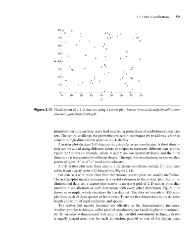
Figure 2.13 Visualization of a 2-D data set using a scatter plot. Source: www.cs.sfu.ca/jpei/publications/
rareevent-geoinformatica06.pdf .
projection techniques help users find interesting projections of multidimensional data
sets. The central challenge the geometric projection techniques try to address is how to
visualize a high-dimensional space on a 2-D display.
A scatter plot displays 2-D data points using Cartesian coordinates. A third dimen-
sion can be added using different colors or shapes to represent different data points.
Figure 2.13 shows an example, where X and Y are two spatial attributes and the third
dimension is represented by different shapes. Through this visualization, we can see that
points of types “+” and “×” tend to be colocated.
A 3-D scatter plot uses three axes in a Cartesian coordinate system. If it also uses
color, it can display up to 4-D data points (Figure 2.14).
For data sets with more than four dimensions, scatter plots are usually ineffective.
The scatter-plot matrix technique is a useful extension to the scatter plot. For an n-
dimensional data set, a scatter-plot matrix is an n × n grid of 2-D scatter plots that
provides a visualization of each dimension with every other dimension. Figure 2.15
shows an example, which visualizes the Iris data set. The data set consists of 450 sam-
ples from each of three species of Iris flowers. There are five dimensions in the data set:
length and width of sepal and petal, and species.
The scatter-plot matrix becomes less effective as the dimensionality increases.
Another popular technique, called parallel coordinates, can handle higher dimensional-
ity. To visualize n-dimensional data points, the parallel coordinates technique draws
n equally spaced axes, one for each dimension, parallel to one of the display axes.