
Page 101 -
P. 101
HAN 09-ch02-039-082-9780123814791
64 Chapter 2 Getting to Know Your Data 2011/6/1 3:15 Page 64 #26
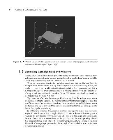
Figure 2.19 “Worlds-within-Worlds” (also known as n-Vision). Source: http://graphics.cs.columbia.edu/
projects/AutoVisual/images/1.dipstick.5.gif.
2.3.5 Visualizing Complex Data and Relations
In early days, visualization techniques were mainly for numeric data. Recently, more
and more non-numeric data, such as text and social networks, have become available.
Visualizing and analyzing such data attracts a lot of interest.
There are many new visualization techniques dedicated to these kinds of data. For
example, many people on the Web tag various objects such as pictures, blog entries, and
product reviews. A tag cloud is a visualization of statistics of user-generated tags. Often,
in a tag cloud, tags are listed alphabetically or in a user-preferred order. The importance
of a tag is indicated by font size or color. Figure 2.21 shows a tag cloud for visualizing
the popular tags used in a Web site.
Tag clouds are often used in two ways. First, in a tag cloud for a single item, we can
use the size of a tag to represent the number of times that the tag is applied to this item
by different users. Second, when visualizing the tag statistics on multiple items, we can
use the size of a tag to represent the number of items that the tag has been applied to,
that is, the popularity of the tag.
In addition to complex data, complex relations among data entries also raise chal-
lenges for visualization. For example, Figure 2.22 uses a disease influence graph to
visualize the correlations between diseases. The nodes in the graph are diseases, and
the size of each node is proportional to the prevalence of the corresponding disease.
Two nodes are linked by an edge if the corresponding diseases have a strong correlation.
The width of an edge is proportional to the strength of the correlation pattern of the two
corresponding diseases.