
Page 41 - Digital Analysis of Remotely Sensed Imagery
P. 41
14 Cha pte r O n e
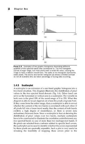
Histogram
18195
0
1 2047
(a)
Histogram
28894
0
80 2047
(b)
FIGURE 1.5 Examples of two graphic histograms illustrating different
qualities of the spectral bands they correspond to. The fi rst histogram
(a) has a larger range, but most pixels have a small DN value, causing the
image to have a darkish overall tone. The spike in the histogram represents
water pixels. The skinny and narrow histogram (b) shows a limited contrast
as not all available DNs are taken advantage of during data recording.
1.4.5 Scatterplot
A scatterplot is an extension of a one-band graphic histogram into a
two-band situation. This diagram illustrates the distribution of pixel
values in the two spectral band domain (Fig. 1.6). Either band can
serve as the horizontal or vertical axis in a scatterplot. The variable in
both axes is the pixel DN of the usual range of 0 to 255. What this
diagram is able to reveal depends on where the pixels originate from.
If they come from the entire image, then a scatterplot is able to reveal
whether the content of the two bands is correlated with each other. If
all pixels fall into a linear trend neatly, then the content of both bands
exhibits a high degree of resemblance, or there is severe data
redundancy between them. Since a scatterplot is best at showing the
distribution of pixel values over two bands, multiple scatterplots
have to be constructed to illustrate the correlation extent between any
two spectral bands in case of more than two multispectral bands. If
the pixels are selected from a subarea related to specific land covers,
thescatterplot can be used to identify whether the covers represented
by these pixels are spectrally separable. Such a plot is very useful in
revealing the feasibility of mapping these covers prior to the