
Page 407 - Excel 2007 Bible
P. 407
25_044039 ch19.qxp 11/21/06 11:10 AM Page 364
Part III
Creating Charts and Graphics
Choosing a chart type
A common question among Excel users is “How do I know which chart type to use for my data?”
Unfortunately, this question has no cut-and-dried answer to. Perhaps the best answer is a vague one: Use
the chart type that gets your message across in the simplest way.
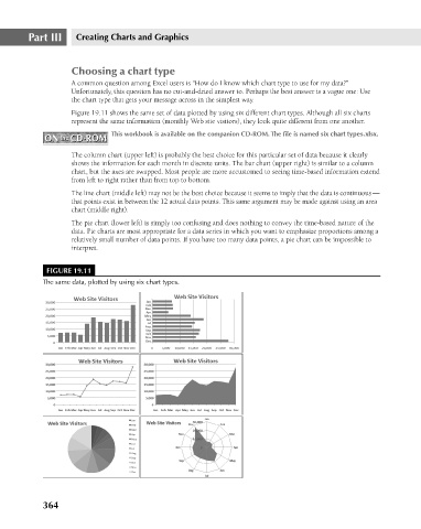
Figure 19.11 shows the same set of data plotted by using six different chart types. Although all six charts
represent the same information (monthly Web site visitors), they look quite different from one another.
This workbook is available on the companion CD-ROM. The file is named six chart types.xlsx.
ON the CD-ROM
ON the CD-ROM
The column chart (upper left) is probably the best choice for this particular set of data because it clearly
shows the information for each month in discrete units. The bar chart (upper right) is similar to a column
chart, but the axes are swapped. Most people are more accustomed to seeing time-based information extend
from left to right rather than from top to bottom.
The line chart (middle left) may not be the best choice because it seems to imply that the data is continuous —
that points exist in between the 12 actual data points. This same argument may be made against using an area
chart (middle right).
The pie chart (lower left) is simply too confusing and does nothing to convey the time-based nature of the
data. Pie charts are most appropriate for a data series in which you want to emphasize proportions among a
relatively small number of data points. If you have too many data points, a pie chart can be impossible to
interpret.
FIGURE 19.11
The same data, plotted by using six chart types.
364