
Page 411 - Excel 2007 Bible
P. 411
25_044039 ch19.qxp 11/21/06 11:10 AM Page 368
Part III
Creating Charts and Graphics
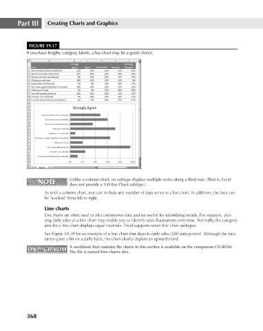
FIGURE 19.17
If you have lengthy category labels, a bar chart may be a good choice.
NOTE Unlike a column chart, no subtype displays multiple series along a third axis. (That is, Excel
NOTE
does not provide a 3-D Bar Chart subtype.)
As with a column chart, you can include any number of data series in a bar chart. In addition, the bars can
be “stacked” from left to right.
Line charts
Line charts are often used to plot continuous data and are useful for identifying trends. For example, plot-
ting daily sales as a line chart may enable you to identify sales fluctuations over time. Normally, the category
axis for a line chart displays equal intervals. Excel supports seven line chart subtypes.
See Figure 19.18 for an example of a line chart that depicts daily sales (200 data points). Although the data
varies quite a bit on a daily basis, the chart clearly depicts an upward trend.
A workbook that contains the charts in this section is available on the companion CD-ROM.
ON the CD-ROM The file is named line charts.xlsx.
ON the CD-ROM
368