Page 414 - Excel 2007 Bible
P. 414
25_044039 ch19.qxp  11/21/06  11:10 AM  Page 371
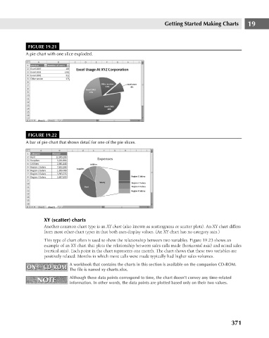
                                      FIGURE 19.21
                                     A pie chart with one slice exploded.
                                      FIGURE 19.22
                                     A bar of pie chart that shows detail for one of the pie slices.  Getting Started Making Charts  19


                                             XY (scatter) charts
                                             Another common chart type is an XY chart (also known as scattergrams or scatter plots). An XY chart differs
                                             from most other chart types in that both axes display values. (An XY chart has no category axis.)
                                             This type of chart often is used to show the relationship between two variables. Figure 19.23 shows an
                                             example of an XY chart that plots the relationship between sales calls made (horizontal axis) and actual sales
                                             (vertical axis). Each point in the chart represents one month. The chart shows that these two variables are
                                             positively related: Months in which more calls were made typically had higher sales volumes.
                                                       A workbook that contains the charts in this section is available on the companion CD-ROM.
                                      ON  the  CD-ROM  The file is named xy charts.xlsx.
                                      ON  the  CD-ROM
                                          NOTE         Although these data points correspond to time, the chart doesn’t convey any time-related
                                          NOTE
                                                       information. In other words, the data points are plotted based only on their two values.


                                                                                                                      371

