
Page 413 - Excel 2007 Bible
P. 413
25_044039 ch19.qxp 11/21/06 11:10 AM Page 370
Part III
Creating Charts and Graphics
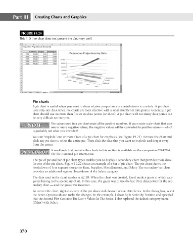
FIGURE 19.20
This 3-D line chart does not present the data very well.
Pie charts
A pie chart is useful when you want to show relative proportions or contributions to a whole. A pie chart
uses only one data series. Pie charts are most effective with a small number of data points. Generally, a pie
chart should use no more than five or six data points (or slices). A pie chart with too many data points can
be very difficult to interpret.
NOTE The values used in a pie chart must all be positive numbers. If you create a pie chart that uses
NOTE
one or more negative values, the negative values will be converted to positive values — which
is probably not what you intended!
You can “explode” one or more slices of a pie chart for emphasis (see Figure 19.21). Activate the chart and
click any pie slice to select the entire pie. Then click the slice that you want to explode and drag it away
from the center.
A workbook that contains the charts in this section is available on the companion CD-ROM.
ON the CD-ROM The file is named pie charts.xlsx.
ON the CD-ROM
The pie of pie and bar of pie chart types enables you to display a secondary chart that provides more detail
for one of the pie slices. Figure 19.22 shows an example of a bar of pie chart. The pie chart shows the
breakdown of four expense categories Rent, Supplies, Miscellaneous, and Salary. The secondary bar chart
provides an additional regional breakdown of the Salary category.
The data used in the chart resides in A2:B8. When the chart was created, Excel made a guess at which cate-
gories belong to the secondary chart. In this case, the guess was to use the last three data points for the sec-
ondary chart — and the guess was incorrect.
To correct the chart, right-click any of the pie slices and choose Format Data Series. In the dialog box, select
the Series Options tab and make the changes. In this example, I chose Split Series By Position and specified
that the Second Plot Contains The Last 4 Values In The Series. I also replaced the default category name
(Other) with Salary.
370