
Page 417 - Excel 2007 Bible
P. 417
25_044039 ch19.qxp 11/21/06 11:10 AM Page 374
Part III
Creating Charts and Graphics
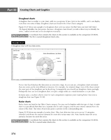
Doughnut charts
A doughnut chart is similar to a pie chart, with two exceptions: It has a hole in the middle, and it can display
more than one series of data. Doughnut charts are listed in the Other Charts category.
Figure 19.27 shows an example of a doughnut chart with two series (1st Half Sales and 2nd Half Sales).
The legend identifies the data points. Because a doughnut chart doesn’t provide a direct way to identify the
series, I added arrows and series descriptions manually.
A workbook that contains the charts in this section is available on the companion CD-ROM.
ON the CD-ROM
ON the CD-ROM
The file is named doughnut charts.xlsx.
FIGURE 19.27
A doughnut chart with two data series.
Notice that Excel displays the data series as concentric rings. As you can see, a doughnut chart with more
than one series can be very difficult to interpret. For example, the relatively larger sizes of the slices toward
the outer part of the doughnut can be deceiving. Consequently, you should use doughnut charts sparingly.
Perhaps the best use for a doughnut chart is to plot a single series as a visual alternative to a pie chart.
In many cases, a stacked column chart for such comparisons expresses your meaning better than does a
doughnut chart (see Figure 19.28).
Radar charts
Radar charts are listed in the Other Charts category. You may not be familiar with this type of chart. A radar
chart is a specialized chart that has a separate axis for each category, and the axes extend outward from the
center of the chart. The value of each data point is plotted on the corresponding axis.
Figure 19.29 shows an example of a radar chart. This chart plots two data series across 12 categories
(months) and shows the seasonal demand for snow skis versus water skis. Note that the water-ski series
partially obscures the snow-ski series.
A workbook that contains the charts in this section is available on the companion CD-ROM.
ON the CD-ROM The file is named radar charts.xlsx.
ON the CD-ROM
374