
Page 420 - Excel 2007 Bible
P. 420
25_044039 ch19.qxp 11/21/06 11:10 AM Page 377
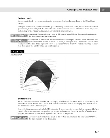
Surface charts
Surface charts display two or more data series on a surface. Surface charts are listed in the Other Charts
category.
As Figure 19.32 shows, these charts can be quite interesting. Unlike other charts, Excel uses color to distin-
guish values, not to distinguish the data series. The number of colors used is determined by the major unit
scale setting for the value axis. Each color corresponds to one major unit.
A workbook that contains the charts in this section is available on the companion CD-ROM.
ON the CD-ROM
ON the CD-ROM
The file is named surface charts.xlsx.
It’s important to understand that a surface chart does not plot 3-D data points. The series axis
NOTE
NOTE
for a surface chart, as with all other 3-D charts, is a category axis — not a value axis. In other
words, if you have data that is represented by x, y, and z coordinates, it can’t be plotted accurately on a sur-
face chart unless the x and y values are equally spaced.
FIGURE 19.32
A surface chart.
Bubble charts Getting Started Making Charts 19
Think of a bubble chart as an XY chart that can display an additional data series, which is represented by the
size of the bubbles. As with an XY chart, both axes are value axes (there is no category axis). Bubble charts
are listed in the Other Charts category.
Figure 19.33 shows an example of a bubble chart that depicts the results of a weight-loss program. The hor-
izontal value axis represents the original weight, the vertical value axis shows the number of weeks in the
program, and the size of the bubbles represents the amount of weight lost.
A workbook that contains the charts in this section is available on the companion CD-ROM.
ON the CD-ROM The file is named bubble charts.xlsx.
ON the CD-ROM
377