
Page 408 - Excel 2007 Bible
P. 408
25_044039 ch19.qxp 11/21/06 11:10 AM Page 365
Getting Started Making Charts
The radar chart (lower right) is clearly inappropriate for this data. People aren’t accustomed to viewing
time-based information in a circular direction!
Fortunately, changing a chart’s type is an easy procedure, so you can experiment with various chart types
until you find the one that represents your data accurately, clearly, and as simply as possible.
The remainder of this chapter contains lots of information about Excel’s various chart types. The examples
and discussion may give you a better handle on determining the most appropriate chart type for your data.
Chart type examples
After you select the data to use in a chart, the next step is to select the type of chart. The commands in the
Insert ➪ Charts group are all drop-down controls. Click a control, and you see icons that represent the sub-
types for the chart type. For example, a Line chart has seven subtypes.
The remainder of this section discusses each of Excel’s standard chart types and shows examples of each.
Column charts
Probably the most common chart type is column charts. A column chart displays each data point as a vertical
column, the height of which corresponds to the value. The value scale is displayed on the vertical axis,
which is usually on the left side of the chart. You can specify any number of data series, and the correspond- 19
ing data points from each series can be stacked on top of each other. Typically, each data series is depicted
in a different color or pattern.
Column charts are often used to compare discrete items, and they can depict the differences between items
in a series or items across multiple series. Excel offers seven column-chart subtypes.
A workbook that contains the charts in this section is available on the companion CD-ROM.
ON the CD-ROM The file is named column charts.xlsx.
ON the CD-ROM
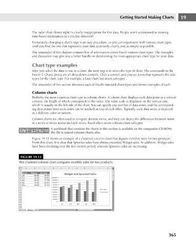
Figure 19.12 shows an example of a clustered column chart that depicts monthly sales for two products.
From this chart, it is clear that Sprocket sales have always exceeded Widget sales. In addition, Widget sales
have been declining over the five-month period, whereas Sprocket sales are increasing.
FIGURE 19.12
This clustered column chart compares monthly sales for two products.
365