
Page 409 - Excel 2007 Bible
P. 409
25_044039 ch19.qxp 11/21/06 11:10 AM Page 366
Part III
Creating Charts and Graphics
The same data, in the form of a stacked column chart, is shown in Figure 19.13. This chart has the added
advantage of depicting the combined sales over time. It shows that total sales have remained fairly steady
each month, but the relative proportions of the two products have changed.
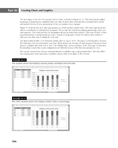
Figure 19.14 shows the same sales data plotted as a 100% stacked column chart. This chart type shows the
relative contribution of each product by month. Notice that the vertical axis displays percentage values, not
sales amounts. This chart provides no information about the actual sales volumes. This type of chart is often
a good alternative to using several pie charts. Instead of using a pie to show the relative sales volume in
each year, the chart uses a column for each year.
The data is plotted with a 3-D clustered column chart in Figure 19.15. The name is a bit deceptive, because
the chart uses only two dimensions, not three. Many people use this type of chart because it has more visual
pizzazz. Compare this chart with a “true” 3-D column chart, shown in Figure 19.16. This type of chart may
be appealing visually, but precise comparisons are difficult because of the distorted perspective view.
You can also choose from column variations known as cylinder, cone, and pyramid charts. The only differ-
ence among these chart types and a standard column chart is the shape of the columns.
FIGURE 19.13
This stacked column chart displays sales by product and depicts the total sales.
FIGURE 19.14
This 100% stacked column chart display monthly sales as a percentage.
366