
Page 131 - Lean six sigma demystified
P. 131
110 Lean Six Sigma DemystifieD
Microsoft Excel is a tremendously powerful tool for Lean Six Sigma, but most
people don’t even know how to use the basic capabilities of Excel. If you think
you’re a hotshot Excel user, read on because we’ll look at how to use the QI
Macros Lean Six Sigma SPC software for Excel. If you’re not that familiar with
Excel and how to set up your data to make it easy to analyze, chart, and graph,
then you will get a lot from this discussion. If you don’t own a copy of Excel or
Office, you can usually pick up inexpensive copies of older versions at eBay.
com. The QI Macros work in all versions of Excel.
RemembeR You can download your free 90-day trial of the QI Macros from
www.qimacros.com/demystified.html.
Setting Up Your Data in Excel
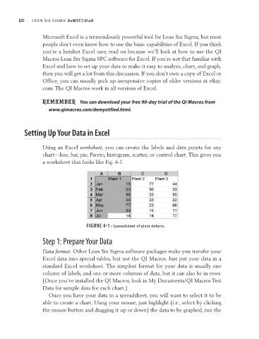
Using an Excel worksheet, you can create the labels and data points for any
chart—line, bar, pie, Pareto, histogram, scatter, or control chart. This gives you
a worksheet that looks like Fig. 4-1.
FIGURE 4-1 • Spreadsheet of plant defects.
Step 1: Prepare Your Data
Data format. Other Lean Six Sigma software packages make you transfer your
Excel data into special tables, but not the QI Macros. Just put your data in a
standard Excel worksheet. The simplest format for your data is usually one
column of labels, and one or more columns of data, but it can also be in rows.
(Once you’ve installed the QI Macros, look in My Documents/QI Macros Test
Data for sample data for each chart.)
Once you have your data in a spreadsheet, you will want to select it to be
able to create a chart. Using your mouse, just highlight (i.e., select by clicking
the mouse button and dragging it up or down) the data to be graphed, run the