
Page 132 - Lean six sigma demystified
P. 132
Chapter 4 e xC e L Power Too LS for Lean Six Sigm a 111
appropriate macro, and Excel with the QI Macros will do all the scary math and
draw the graph.
Tips for Selecting Your Data
• Click and drag with the mouse to select the data.
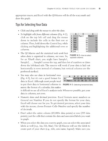
• To highlight cells from different columns (Fig. 4-2),
click on the top left cell and drag the mouse
down to include the cells in the first row or
column. Then, hold down the Control key, while
clicking and highlighting the additional rows or
columns.
• The QI Macros and the statistical tools work best
when data is organized in columns, not rows. So, FIGURE 4-2 • How to select
separate columns.
for an XbarR chart, you might have Sample1,
Sample2, . . ., Sample5 across the top, and then lot of numbers or dates
down the left-hand side. The macros will work if your data is laid out
horizontally in rows instead of columns, but vertical columns are the
preferred method.
• You may also use data in horizontal rows
(Fig. 4-3), but it’s not a good format for
data in Excel. Although most people tend
to put their data in horizontal columns to FIGURE 4-3 • Selecting horizontal data.
mimic the format of a calendar, this makes
it difficult to use all of Excel’s analysis tools. Whenever possible, put your
data in columns, not rows.
• Numeric data and decimal precision. Excel formats most numbers as
General not Number. If you do not specify the format for your data,
Excel will choose one for you. To get desired precision, select your data
with the mouse, choose Format–Cells–Number and specify the number
of decimals.
• Don’t select the entire column (65,000+ data points) or row (255 data
points), just the cells that contain the data and associated labels you want
to graph.
• When you select the data you want to graph, you can select the associated
labels as well (e.g., Jan, Feb, Mar). The QI Macros will use the labels to
create part of your chart (e.g., title, axis name, legend). Make sure you