
Page 159 - Lean six sigma demystified
P. 159
138 Lean Six Sigma DemystifieD
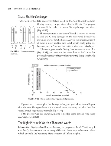
Space Shuttle Challenger
Tufte tackles the data and presentation used by Morton Thiokol to show
O-ring damage on previous shuttle flights. The graphs
use cute little rockets to show O-ring damage over time
70 67 53 (Fig. 4-37).
The temperature at the time of launch is shown on rocket
A, and the O-ring damage on the recovered boosters is
shown as gray or hatched areas. As you can imagine, put 50
of these in a row and it’s hard to tell what’s really going on,
13 13 14 14 15 15 because you can’t detect the pattern with your naked eye.
A B A B A B
If, however, you use the O-ring data to draw a scatter plot
FIGURE 4-37 • Thiokol rockets (Fig. 4-38), you can use the trend line to back into the
example.
potentially catastrophic problems awaiting the space shuttle
Challenger.
n = 23 O-Ring damage on space shuttles
12 Damage index
10 8 y = mx + b
Damage index 6 4 Projected shuttle challenger launch temperature
2
0
20 30 40 50 60 70 80 90
–2 Launch temperature fahrenheit
FIGURE 4-38 • O-ring scatter showing projected problems.
If you use a c chart to plot the damage index, you get a chart that tells you
that the one 53-degree launch is a special cause variation, but also that the
entire launch sequence is unstable (Fig. 4-39).
If the process was this unstable, maybe it needed some serious root cause
analysis before liftoff.
The Right Picture Is Worth a Thousand Words
Information displays should serve the analytic purpose at hand. That’s why I
use the QI Macros to draw as many different charts as possible to explore
which one tells the best story. Here are some of Tufte’s insights.