
Page 160 - Lean six sigma demystified
P. 160
Chapter 4 e xC e L Power Too LS for Lean Six Sigm a 139
Damage index
12
UCL
10 +2 Sigma
+1 Sigma
Average
8 –1 Sigma
–2 Sigma
Damage index 6 UCL Plot area LCL 5.03
4
2 CL 1.43
0
04/12/81 11/12/81 03/22/82 11/11/82 04/04/83 06/18/83 08/03/83 11/28/83 02/03/84 04/06/84 08/30/84 10/05/84 11/08/84 01/24/85 04/12/85 04/29/85 06/17/85 07/29/85 08/27/85 10/03/85 10/30/85 11/26/85 01/12/86
Shuttle launch
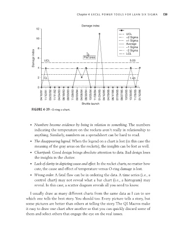
FIGURE 4-39 • O-ring c-chart.
• Numbers become evidence by being in relation to something. The numbers
indicating the temperature on the rockets aren’t really in relationship to
anything. Similarly, numbers on a spreadsheet can be hard to read.
• The disappearing legend. When the legend on a chart is lost (in this case the
meaning of the gray areas on the rockets), the insights can be lost as well.
• Chartjunk. Good design brings absolute attention to data. Bad design loses
the insights in the clutter.
• Lack of clarity in depicting cause and effect. In the rocket charts, no matter how
cute, the cause and effect of temperature versus O-ring damage is lost.
• Wrong order. A fatal flaw can be in ordering the data. A time series (i.e., a
control chart) may not reveal what a bar chart (i.e., a histogram) may
reveal. In this case, a scatter diagram reveals all you need to know.
I usually draw as many different charts from the same data as I can to see
which one tells the best story. You should too. Every picture tells a story, but
some pictures are better than others at telling the story. The QI Macros make
it easy to draw one chart after another so that you can quickly discard some of
them and select others that engage the eye on the real issues.