
Page 147 - Sustainability in the Process Industry Integration and Optimization
P. 147
124 Cha p te r S i x
ammonia are usually formed as part of the reaction products. The
effluent from the reactor is then cooled down and sent to a high-
pressure flash separator. The gas released in the separator is often
treated in an amine scrubber that removes H S. Part of the gas is
2
vented from the process through a high-pressure purge to prevent
any buildup of hydrocarbons in the recycle. The remaining hydrogen-
rich gas is recompressed and then returned to the reactor with a
fresh hydrogen makeup stream. The liquid stream removed from the
bottom of the high-pressure separator contains some hydrogen, light
hydrocarbon gases and H S in the solution, which is lost from the
2
hydrogen system. This liquid stream is sent to a low-pressure
separator, from which off-gases are taken and typically sent to a flare
or to the fuel gas system.
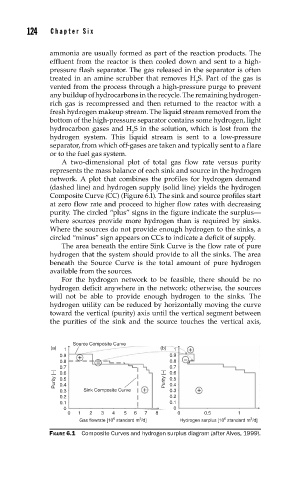
A two-dimensional plot of total gas flow rate versus purity
represents the mass balance of each sink and source in the hydrogen
network. A plot that combines the profiles for hydrogen demand
(dashed line) and hydrogen supply (solid line) yields the hydrogen
Composite Curve (CC) (Figure 6.1). The sink and source profiles start
at zero flow rate and proceed to higher flow rates with decreasing
purity. The circled “plus” signs in the figure indicate the surplus—
where sources provide more hydrogen than is required by sinks.
Where the sources do not provide enough hydrogen to the sinks, a
circled “minus” sign appears on CCs to indicate a deficit of supply.
The area beneath the entire Sink Curve is the flow rate of pure
hydrogen that the system should provide to all the sinks. The area
beneath the Source Curve is the total amount of pure hydrogen
available from the sources.
For the hydrogen network to be feasible, there should be no
hydrogen deficit anywhere in the network; otherwise, the sources
will not be able to provide enough hydrogen to the sinks. The
hydrogen utility can be reduced by horizontally moving the curve
toward the vertical (purity) axis until the vertical segment between
the purities of the sink and the source touches the vertical axis,
Source Composite Curve
(a) 1 (b) 1
0.9 0.9
0.8 – 0.8 –
0.7 0.7
Purity [–] 0.6 Purity [–] 0.6
0.5
0.5
0.4
0.4
0.3 Sink Composite Curve 0.3
0.2 0.2
0.1 0.1
0 0
0 1 2 3 4 5 6 7 8 0 0.5 1
6
3
6
3
Gas flowrate [10 standard m /d] Hydrogen surplus [10 standard m /d]
FIGURE 6.1 Composite Curves and hydrogen surplus diagram (after Alves, 1999).