
Page 186 - The Six Sigma Project Planner
P. 186
The process for developing the strategy deployment matrix is as follows:
1. Create a matrix of the strategies and metrics.
2. Determine the strength of the relationship between each strategy and each
metric.
3. Calculate a weight indicating the relative importance of the metric.
To begin, we create a matrix where the rows are the strategies (what we want to
accomplish) and the columns are the dashboard metrics (how we will operationalize the
strategies and monitor progress). Note that this is the typical what-how QFD matrix
layout, just with a different spin. In each cell (intersection of a row and a column), we
will place a symbol assigning a weight to the relationship between the row and the
column. The weights and symbols used are shown in Figure 30.
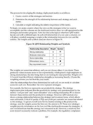
Figure 30. QFD Relationship Weights and Symbols
Relationship Description Weight Symbol
Strong relationship 9
Moderate relationship 3
Some relationship 1
Differentiator metric 5
Key requirement metric 1
The weights are somewhat arbitrary and you can choose others if you desire. These
particular values increase more or less exponentially, which places a high emphasis on
strong relationships, the idea being that we are looking for clear priorities. Weights of 1-
2-3 would treat the different relationship strengths as increasing linearly. Choose the
weighting scheme you feel best fits your needs.
After the relationships have been determined for each cell, we are ready to calculate
scores for each row. Remember: the rows represent strategies.
For example, the first row represents our productivity strategy. The strategy
deployment plan indicated that the productivity strategy was operationalized by the
metrics “cost per unit” and “asset utilization” and a strong relationship ( ) is shown
between these metrics and the productivity strategy. However, QFD analysis also
shows a strong relationship between this strategy and inventory turns, which affects
asset utilization. Critical to quality (CTQ) and profit per customer are somewhat related
to this strategy. To get an overall score for the metrics relating to the productivity
strategy, sum the weights across the first row; the answer is 29. These row (strategy)
weights provide information on the how well the dashboards measure the strategies. A
zero would indicate that the strategy isn’t measured at all. However, a relatively low
score doesn’t necessarily indicate a problem. For example, the regulatory compliance
169