
Page 360 - The Toyota Way Fieldbook
P. 360
Chapter 14. Develop a Thorough Understanding 335
the same, the future results are more predictable (not likely to get worse) and the
consequences of inaction (which is always a considered action) are understood.
The goal is to portray the situation so an accurate assessment is possible.
This is best achieved using actual facts and not assumptions or “feelings.” Be wary
of data coupled with the words “I think” or “ I feel”! The goal is to elevate problems
and to get a clear understanding of their characteristics so we can understand
what will be required to solve them and how difficult that will be. A problem
that’s stated in a way that makes it look better than it truly is does not help in
the problem-solving process (Figure 14-9).
Also consider the stability of the problem. Are the results consistent day-to-day
(or period-to- period), or are there large swings with varied good and bad results?
Problems with a high degree of variation from period to period indicate a situation
that is out of control. There are probably many contributing factors, and isolating
the causes may be difficult. An intermittent problem is also harder to analyze
because it does not occur consistently, and therefore seeing the problem firsthand
is difficult and often requires an extended observation to identify the causes.
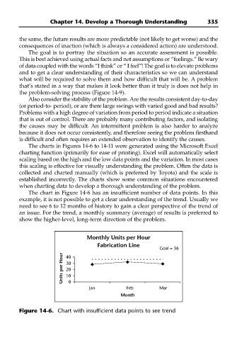
The charts in Figures 14-6 to 14-11 were generated using the Microsoft Excel
charting function (primarily for ease of printing). Excel will automatically select
scaling based on the high and the low data points and the variation. In most cases
this scaling is effective for visually understanding the problem. Often the data is
collected and charted manually (which is preferred by Toyota) and the scale is
established incorrectly. The charts show some common situations encountered
when charting data to develop a thorough understanding of the problem.
The chart in Figure 14-6 has an insufficient number of data points. In this
example, it is not possible to get a clear understanding of the trend. Usually we
need to see 6 to 12 months of history to gain a clear perspective of the trend of
an issue. For the trend, a monthly summary (average) of results is preferred to
show the higher-level, long-term direction of the problem.
Monthly Units per Hour
Fabrication Line
Goal = 36
Units per Hour 30
40
20
10
0
Jan Feb Mar
Month
Figure 14-6. Chart with insufficient data points to see trend