
Page 366 - Between One and Many The Art and Science of Public Speaking
P. 366
Speaking of . . .
PowerPoint Poisoning
Too much PowerPoint can be like too much of anything you let them take over the show, you will be ignored
else—deadly, at least to your audience. Even in business the as a speaker.
heads of some corporations are telling their subordinates to • Too little focus on the speaker. There have been
1
use this technology sparingly. Here are some common pit-
times when normal delivery skills have been forgotten
falls of PowerPoint use you’ll want to avoid:
as a speaker focuses attention solely on the slides.
• Too many slides. We’ve seen PowerPoint pre- No matter what visuals you use, ultimately it is you,
sentations where almost every couple of sentences the speaker, who is responsible for making your
the speaker shifts to a new slide. Trying to keep up presentation engaging.
with what is being said and what is being shown is • PowerPoint used when it shouldn’t be. Not every
impossible. speech calls for a PowerPoint presentation. Imagine
• Too much detail on slides. Use key words, a wedding toast with PowerPoint. It just doesn’t make
phrases, and visuals, not full sentences. We’ve seen sense. Make sure if you use PowerPoint that it really
speakers put virtually every word in their manuscript is necessary. If not, leave it out!
overhead. It left us wondering, what is the point of
having a speaker?
1 Joe Downing and Cecile C. Garmon, “Teaching Students in the
• Too much razzle-dazzle. PowerPoint’s special Basic Course How to Use Presentational Software,” Communica-
effects may be “cool,” but not necessarily helpful. If tion Education, 50 (2001): 218–29.
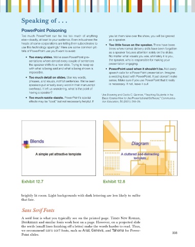
Exhibit 12.7 Exhibit 12.8
brightly lit room. Light backgrounds with dark lettering are less likely to suffer
that fate.
Sans Serif Fonts
A serif font is what you typically see on the printed page. Times New Roman,
Bookman and similar fonts work best on a page. However, on a projected slide
the serifs (small lines fi nishing off a letter) make the words harder to read. Thus,
we recommend sans serif fonts, such as Arial, Geneva, and Tahoma for Power-
333
Point slides.