
Page 475 - Excel 2007 Bible
P. 475
27_044039 ch21.qxp 11/21/06 11:12 AM Page 432
Part III
Creating Charts and Graphics
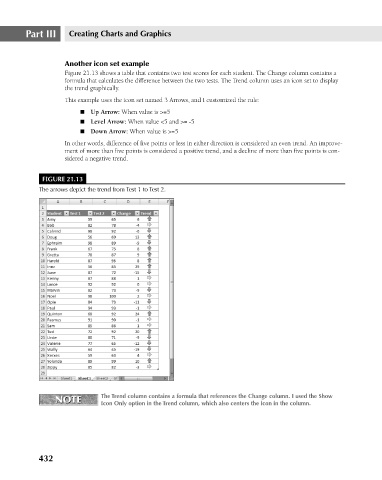
Another icon set example
Figure 21.13 shows a table that contains two test scores for each student. The Change column contains a
formula that calculates the difference between the two tests. The Trend column uses an icon set to display
the trend graphically.
This example uses the icon set named 3 Arrows, and I customized the rule:
n Level Arrow: When value <5 and >= -5
n Down Arrow: When value is >=5
In other words, difference of five points or less in either direction is considered an even trend. An improve-
ment of more than five points is considered a positive trend, and a decline of more than five points is con-
sidered a negative trend.
FIGURE 21.13
The arrows depict the trend from Test 1 to Test 2.
The Trend column contains a formula that references the Change column. I used the Show
NOTE n Up Arrow: When value is >=5
NOTE
Icon Only option in the Trend column, which also centers the icon in the column.
432