
Page 129 - Excel Data Analysis
P. 129
07 537547 Ch06.qxd 3/4/03 12:09 PM Page 115
CHARTING DATA 6
The Type tab on the Add Trendline dialog box provides six different types of
trendlines, each with a different type of comparison of the values in the data
series. To more accurately predict future events, you can observe the shape of
your charted data, and then select a trendline type that best fits the general
trend you see:
TRENDLINE DESCRIPTION
Linear Creates a best-fit straight line that shows how values in a data series increase or
decrease at a steady rate.
Logarithmic Creates a best-fit curved line that illustrates how data values increase or decrease and
then level out. You can use both negative and positive values with a Logarithmic trendline.
Polynomial Creates a curved line illustrating fluctuations in the data values. You specify an Order
value to indicate the maximum number of fluctuations, or bends, that occur on the line.
Power Creates a curved line to compare measurements that increase at a specific rate. You
cannot use a Power trendline with a data series that includes negative or zero values.
Exponential Creates a curved line that shows data values that increase or fall at increasingly higher
rates. You cannot use an Exponential trendline with a data series that includes negative
or zero values.
Moving Average Reduces the fluctuations in the trendline to show a smoother pattern. You use the
Period field to specify the number of data values to create the line. Excel creates the line
by averaging the specific data values. For example, if the Period value is 2, the first two
values are averaged and that value is the first point on the line, and then the second
and third values are averaged and become the second point.
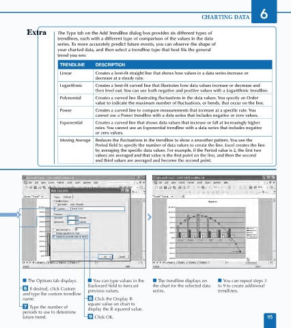
■ The Options tab displays. ■ You can type values in the ■ The trendline displays on ■ You can repeat steps 3
Backward field to forecast the chart for the selected data to 9 to create additional
Á If desired, click Custom previous values. series. trendlines.
and type the custom trendline
name. ° Click the Display R-
square value on chart to
‡ Type the number of display the R-squared value.
periods to use to determine
future trend. · Click OK. 115