
Page 133 - Excel Data Analysis
P. 133
07 537547 Ch06.qxd 3/4/03 12:09 PM Page 119
CHARTING DATA 6
If you have a range of data in a combined chart with different
data types, you can add a secondary axis to help identify the
chart values. Depending upon the chart type, you can typically
add both a secondary x and y axis. For example, if your main
chart is a column chart, the x axis displays at the bottom of the
chart and the y axis displays on the left of the chart. If you add
secondary axes, the secondary y axis displays at the right side
of the chart, and the x axis displays at the top of the chart.
To add secondary axes to a chart, click Chart ➪ Chart Options.
In the Chart Options dialog box, click the Axes tab. If your
chart contains multiple chart types, the Secondary Axis
options display in the bottom-left corner of the Axes tab.
To display a secondary axis, click the corresponding check box
option. The number of axes available varies depending upon
the chart types selected. Some chart types, such as pie and
doughnut charts, have no axes.
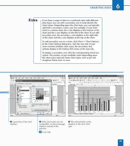
Line
■ A preview of the chart ■ If the chart types are not ■ The selected data series
displays. compatible, an error message displays in the new chart
displays instead of the type.
preview.
‡ Click OK.
119