
Page 66 - Numerical Analysis Using MATLAB and Excel
P. 66
Approximations with Spreadsheets
choose the interval 10 ≤≤– x 10 . Then, we enter −10 and −9 in A2 and A3 respectively. Using
the AutoFill feature, we fill−in the range A4:A22, and we have the interval from −10 to 10 in
increments of 1. We must now delete all rows starting with 23 and downward. We do this by
highlighting the range A23:B102, and we press the Delete key. We observe that the chart has
changed shape to conform to the new data.
Now we select B2 where we enter the formula for the given equation, i.e.,
=3*A2^5−2*A2^3+6*A2−8
We copy this formula to B3:B22. Columns A and B now contain values of x and fx() respec-
tively, and the plot shows that the curve crosses the x−axis somewhere between x = 1 and
x = 2 .
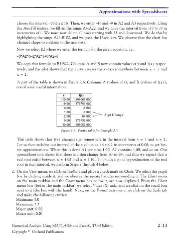
A part of the table is shown in Figure 2.6. Columns A (values of x), and B (values of fx() ),
reveal some useful information.
x f(x)
-10.00 -298068.000
-9.00 -175751.000
0.00 -8.000
1.00 -1.000
2.00 84.000 Sign Change
9.00 175735.000
10.00 298052.000
Figure 2.6. Partial table for Example 2.4
This table shows that fx() changes sign somewhere in the interval from x = 1 and x = . 2
Let us then redefine our interval of the x values as 1 ≤≤ 2 in increments of 0.05, to get bet-
x
ter approximations. When this is done A1 contains 1.00, A2 contains 1.05, and so on. Our
spreadsheet now shows that there is a sign change from B3 to B4, and thus we expect that a
real root exists between x = 1.05 and x = 1.10 . To obtain a good approximation of the real
root in that interval, we perform Steps 2 through 4 below.
2. On the View menu, we click on Toolbars and place a check mark on Chart. We select the graph
box by clicking inside it, and we observe the square handles surrounding it. The Chart menu
on the main taskbar and the Chart menu box below it, are now displayed. From the Chart
menu box (below the main taskbar) we select Value (X) axis, and we click on the small box
next to it (the box with the hand). Next, on the Format axis menu, we click on the Scale tab
and make the following entries:
Minimum: 1.0
Maximum: 1.1
Major unit: 0.02
Minor unit: 0.01
Numerical Analysis Using MATLAB® and Excel®, Third Edition 2−13
Copyright © Orchard Publications