
Page 64 - Numerical Analysis Using MATLAB and Excel
P. 64
Approximations with Spreadsheets
box with the hand icon). On the Format axis menu, we click on the Scale tab, and we make the
following entries:
Minimum: −1.0
Maximum: 1.0
Major unit: 0.25
Minor unit: 0.05
We click on the Number tab, we select Number from the Category column, and we select 2 in
the Decimal places box. We click on the Font tab, select any font, Regular style, Size 9. We click
on the Patterns tab, and we click on Outside on the Major tick mark type (upper right box). We
click on OK to return to the graph.
4. We click on Chart on the main taskbar, and on the Chart Options. We click on Gridlines, we
place check marks on Major gridlines of both Value (X) axis and Value (Y) axis. Then, we click
on the Titles tab and we make the following entries:
Chart title: f(x) = the given equation (or whatever we wish)
Value (X) axis: x (or whatever we wish)
Value (Y) axis: y=f(x) (or whatever we wish)
5. Now, we will change the background of the plot area from gray to white. From the Chart
menu box below the main task bar, we select Plot Area and we observe that the gray back-
ground of the plot area is surrounded by black square handles. We click on the box next to it
(the box with the hand icon), and on the Area side of the Patterns tab, we click on the white
square which is immediately below the gray box. The plot area on the chart now appears on
white background.
6. To make the line of the curve fx() thicker, we click at any point near it and we observe that
several black square handles appear along the curve. Series 1 appears on the Chart menu box.
We click on the small box next to it, and on the Patterns tab. From the Weight selections we
select the first of the thick lines.
7. Finally, to change Chart Area square corners to round, we select Chart Area from the Chart
menu, and on the Patterns tab we place a check mark on the Round corners box.
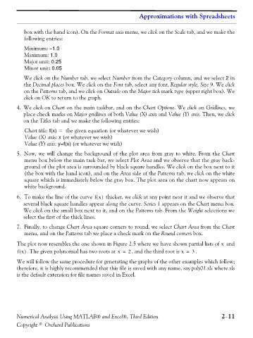
The plot now resembles the one shown in Figure 2.5 where we have shown partial lists of and
x
fx() . The given polynomial has two roots at x = 2 , and the third root is x = . 3
We will follow the same procedure for generating the graphs of the other examples which follow;
therefore, it is highly recommended that this file is saved with any name, say poly01.xls where.xls
is the default extension for file names saved in Excel.
Numerical Analysis Using MATLAB® and Excel®, Third Edition 2−11
Copyright © Orchard Publications