
Page 128 - Six Sigma for electronics design and manufacturing
P. 128
Six Sigma and Manufacturing Control Systems
97
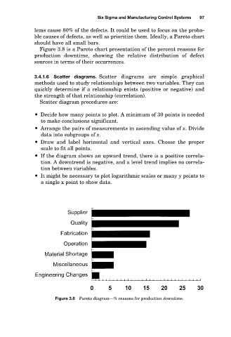
lems cause 80% of the defects. It could be used to focus on the proba-
ble causes of defects, as well as prioritize them. Ideally, a Pareto chart
should have all small bars.
Figure 3.8 is a Pareto chart presentation of the percent reasons for
production downtime, showing the relative distribution of defect
sources in terms of their occurrences.
3.4.1.6 Scatter diagrams. Scatter diagrams are simple graphical
methods used to study relationships between two variables. They can
quickly determine if a relationship exists (positive or negative) and
the strength of that relationship (correlation).
Scatter diagram procedures are:
Decide how many points to plot. A minimum of 30 points is needed
to make conclusions significant.
Arrange the pairs of measurements in ascending value of x. Divide
data into subgroups of x.
Draw and label horizontal and vertical axes. Choose the proper
scale to fit all points.
If the diagram shows an upward trend, there is a positive correla-
tion. A downtrend is negative, and a level trend implies no correla-
tion between variables.
It might be necessary to plot logarithmic scales or many y points to
a single x point to show data.
Figure 3.8 Pareto diagram—% reasons for production downtime.