
Page 135 - Statistics for Environmental Engineers
P. 135
L1592_Frame_C15 Page 132 Tuesday, December 18, 2001 1:50 PM
Graphical Methods
The median, trimmed mean, and Winsorized mean give unbiased estimates of the mean only when the
distribution is symmetrical. Many sets of environmental data are not symmetrical so other approaches
are needed. Even if the distribution is symmetric, the proportion of censored observations may be so
large that the trimmed or Winsorized estimates are not reliable. In these cases, we settle for doing
something helpful without misleading.
Graphical methods, when properly used, reveal all the important features of the data. Graphical methods
are especially important when one is unsure about a particular statistical method. It is better to display the
data rather than to compute a summarizing statistic that hides the data structure and therefore may be
misleading. Suitable plots very often enable a decision to be reached without further analysis.
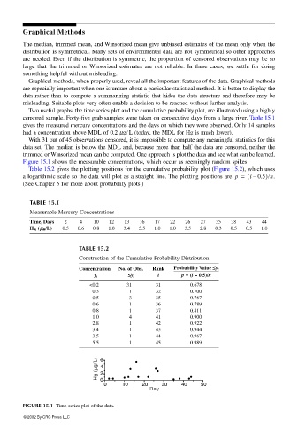
Two useful graphs, the time series plot and the cumulative probability plot, are illustrated using a highly
censored sample. Forty-five grab samples were taken on consecutive days from a large river. Table 15.1
gives the measured mercury concentrations and the days on which they were observed. Only 14 samples
had a concentration above MDL of 0.2 µg/ L (today, the MDL for Hg is much lower).
With 31 out of 45 observations censored, it is impossible to compute any meaningful statistics for this
data set. The median is below the MDL and, because more than half the data are censored, neither the
trimmed or Winsorized mean can be computed. One approach is plot the data and see what can be learned.
Figure 15.1 shows the measurable concentrations, which occur as seemingly random spikes.
Table 15.2 gives the plotting positions for the cumulative probability plot (Figure 15.2), which uses
a logarithmic scale so the data will plot as a straight line. The plotting positions are p = ( i 0.5) n .
–
(See Chapter 5 for more about probability plots.)
TABLE 15.1
Measurable Mercury Concentrations
Time, Days 2 4 10 12 13 16 17 22 26 27 35 38 43 44
Hg (µµ µµg// //L) 0.5 0.6 0.8 1.0 3.4 5.5 1.0 1.0 3.5 2.8 0.3 0.5 0.5 1.0
TABLE 15.2
Construction of the Cumulative Probability Distribution
Concentration No. of Obs. Rank Probability Value ≤≤ ≤≤y i
i p == == (i – 0.5)// //n
y i ≤≤ ≤≤y i
<0.2 31 31 0.678
0.3 1 32 0.700
0.5 3 35 0.767
0.6 1 36 0.789
0.8 1 37 0.811
1.0 4 41 0.900
2.8 1 42 0.922
3.4 1 43 0.944
3.5 1 44 0.967
5.5 1 45 0.989
Hg (µg/L) 6 4 2
0
0 10 20 30 40 50
Day
FIGURE 15.1 Time series plot of the data.
© 2002 By CRC Press LLC