Page 34 - Statistics for Environmental Engineers
P. 34
L1592_frame_C03  Page 25  Tuesday, December 18, 2001  1:41 PM


                       3


                       Plotting Data


                       KEY WORDS box plot, box-and-whisker plot, chartjunk, digidot plot, error bars, matrix scatterplot,
                       percentile plot, residual plots, scatterplot, seasonal subseries plot, time series plot.

                       “The most effective statistical techniques for analyzing environmental data are graphical methods. They
                       are useful in the initial stage for checking the quality of the data, highlighting interesting features of the
                       data, and generally suggesting what statistical analyses should be done. Interesting enough, graphical
                       methods are useful again after intermediate quantitative analyses have been completed, and again in the
                       final stage for providing complete and readily understood summaries of the main findings of investiga-
                       tions (Hunter, 1988).”
                        The first step in data analysis should be to plot the data. Graphing data should be an interactive experimental
                       process (Chatfield, 1988, 1991; Tukey, 1977). Do not expect your first graph to reveal all interesting aspects
                       of the data. Make a variety of graphs to view the data in different ways. Doing this may:

                          1.  reveal the answer so clearly that little more analysis is needed
                          2.  point out properties of the data that would invalidate a particular statistical analysis
                          3.  reveal that the sample contains unusual observations
                          4.  save time in subsequent analyses
                          5.  suggest an answer that you had not expected
                          6.  keep you from doing something foolish

                        The time spent making some different plots almost always rewards the effort. Many top-notch statisti-
                       cians like to plot data by hand, believing that the physical work of the hand stimulates the mind’s eye.
                       Whether you adopt this work method or use one of the many available computer programs, the goal is
                       to free your imagination by trying a  variety of graphical forms.  Keep in mind that some computer
                       programs offer a restricted set of plots and thus could limit rather than expand the imagination.


                       Make the Original Data Record a Plot
                       Because the best way to display data is in a plot, it makes little sense to make the primary data record
                       a table of values. Instead, plot the data directly on a digidot plot, which is Hunter’s (1988) innovative
                       combination of a time-sequence plot with a stem-and-leaf plot (Tukey, 1977) and is extremely useful
                       for a modest-sized collection of data.
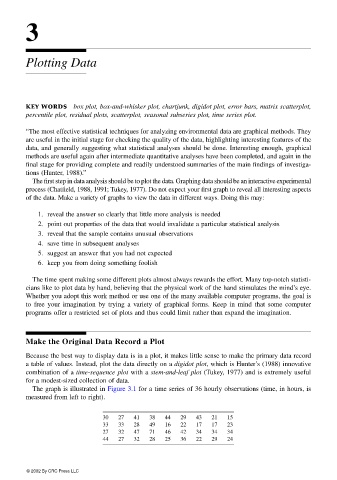
                        The graph is illustrated in Figure 3.1 for a time series of 36 hourly observations (time, in hours, is
                       measured from left to right).


                                            30  27   41  38  44   29  43  21   15
                                            33  33   28  49  16   22  17  17   23
                                            27  32   47  71  46   42  34  34   34
                                            44  27   32  28  25   36  22  29   24


                       © 2002 By CRC Press LLC

