
Page 36 - Statistics for Environmental Engineers
P. 36
L1592_frame_C03 Page 27 Tuesday, December 18, 2001 1:41 PM
looking for patterns; the numerical levels are unimportant at this stage of work. The computer automatically
scales each two-variable scatterplot to best fill the available area of the graph. Each paired combination
of the variables is plotted to reveal possible correlations. For example, it is discovered that effluent total
phosphorus (TP-out) is correlated rather strongly with effluent suspended solids (SS-out) and effluent BOD
(BOD-out), moderately correlated with flow, BOD-in, and not correlated with SS-in and TP-in. Effluent
soluble phosphorus (SP-out) is correlated only with SP-in and TP-out. These observations provide a starting
point for model building.
The values plotted in Figure 3.2 are logarithms of the original variables. Making this transformation
was advantageous in showing extreme values, and it simplified interpretation by giving linear relations
between variables. It is often helpful to use transformations in analyzing environmental data. The logarith-
mic and other transformations are discussed in Chapter 7.
In Search of Trends
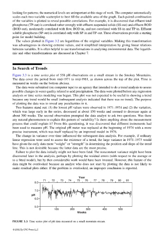
Figure 3.3 is a time series plot of 558 pH observations on a small stream in the Smokey Mountains.
The data cover the period from mid-1971 to mid-1981, as shown across the top of the plot. Time is
measured in weeks on the bottom abcissa.
The data were submitted (on computer tape) to an agency that intended to do a trend analysis to assess
possible changes in water quality related to acid precipitation. The data were plotted before any regression
analysis or time series modeling was begun. This plot was not expected to be useful in showing a trend
because any trend would be small (subsequent analysis indicated that there was no trend). The purpose
of plotting the data was to reveal any peculiarities in it.
Two features stand out: (1) the lowest pH values were observed in 1971–1974 and (2) the variation,
which was large early in the series, decreased at about 150 weeks and seemed to decrease again at
about 300 weeks. The second observation prompted the data analyst to ask two questions. Was there
any natural phenomenon to explain this pattern of variability? Is there anything about the measurement
process that could explain it? From this questioning, it was discovered that different instruments had
been used to measure pH. The original pH meter was replaced at the beginning of 1974 with a more
precise instrument, which was itself replaced by an improved model in 1976.
The change in variance over time influenced the subsequent data analysis. For example, if ordinary
linear regression were used to assess the existence of a trend, the large variance in 1971–1973 would
have given the early data more “weight” or “strength” in determining the position and slope of the trend
line. This is not desirable because the latter data are the most precise.
Failure to plot the data initially might not have been fatal. The nonconstant variance might have been
discovered later in the analysis, perhaps by plotting the residual errors (with respect to the average or
to a fitted model), but by then considerable work would have been invested. However, this feature of the
data might be overlooked because an analyst who does not start by plotting the data is not likely to
make residual plots either. If the problem is overlooked, an improper conclusion is reported.
Year
71 72 73 74 75 76 77 78 79 80 81
8.0
7.0
pH
6.0
5.0
0 100 200 300 400 500
Weeks
FIGURE 3.3 Time series plot of pH data measured on a small mountain stream.
© 2002 By CRC Press LLC