
Page 40 - Statistics for Environmental Engineers
P. 40
L1592_frame_C03 Page 31 Tuesday, December 18, 2001 1:41 PM
100
Total P (mg/L) 10 10
5
1
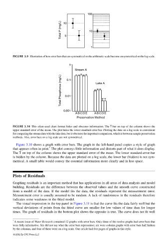
FIGURE 3.9 Illustration of how error bars that are symmetrical on the arithmetic scale become unsymmetrical on the log scale.
1
Stream A
Total Phosphorus (mg/L) 0.01 Lake A
0.1
0.001
A B C D E A B C D E
Preservation Method
FIGURE 3.10 This often-used chart format hides and obscures information. The T-bar on top of the column shows the
upper standard error of the mean. The plot hides the lower standard error bar. Plotting the data on a log scale is convenient
for comparing the stream data with the lake data, but it obscures the important comparison, which is between sample preservation
methods. Also, error bars on a log scale are not symmetrical.
Figure 3.10 shows a graph with error bars. The graph in the left-hand panel copies a style of graph
1
that appears often in print. The plot conveys little information and distorts part of what it does display.
The T on top of the column shows the upper standard error of the mean. The lower standard-error-bar
is hidden by the column. Because the data are plotted on a log scale, the lower bar (hidden) is not sym-
metrical. A small table would convey the essential information more clearly and in less space.
Plots of Residuals
Graphing residuals is an important method that has applications in all areas of data analysis and model
building. Residuals are the difference between the observed values and the smooth curve constructed
from a model of the data. If the model fits the data, the residuals represent the measurement error.
Measurement error is usually assumed to be random. A lack of randomness in the residuals therefore
indicates some weakness in the fitted model.
The visual impression in the top panel in Figure 3.11 is that the curve fits the data fairly well but the
vertical deviations of points from the fitted curve are smaller for low values of time than for longer
times. The graph of residuals in the bottom plot shows the opposite is true. The curve does not fit well
1
A recent issue of Water Research contained 12 graphs with error bars. Only three of the twelve graphs had error bars that
were fully informative. Six did not say what the error bars represented, six were column graphs with error bars half hidden
by the columns, and four of these were on a log scale. One article had five pages of graphs in this style.
© 2002 By CRC Press LLC