
Page 42 - Statistics for Environmental Engineers
P. 42
L1592_frame_C03 Page 33 Tuesday, December 18, 2001 1:41 PM
4000
Residuals from average -2000
2000
0
-4000
0 20 40 60 80 100 120
Standard concentration (mg/L)
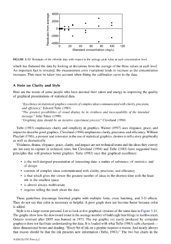
FIGURE 3.13 Residuals of the chloride data with respect to the average peak value at each concentration level.
which has flattened the data by looking at deviations from the average of the three values at each level.
An important fact is revealed: the measurement error (variation) tends to increase as the concentration
increases. This must be taken into account when fitting the calibration curve to the data.
A Note on Clarity and Style
Here are the words of some people who have devoted their talent and energy to improving the quality
of graphical presentations of statistical data.
“Excellence in statistical graphics consists of complex ideas communicated with clarity, precision,
and efficiency.” Edward Tufte (1983)
“The greatest possibilities of visual display lie in vividness and inescapability of the intended
message.” John Tukey (1990)
“Graphing data should be an iterative experiment process.” Cleveland (1994)
Tufte (1983) emphasizes clarity and simplicity in graphics. Wainer (1997) uses elegance, grace, and
impact to describe good graphics. Cleveland (1994) emphasizes clarity, precision, and efficiency. William
Playfair (1786), a pioneer and innovator in the use of statistical graphics, desires to tell a story graphically
as well as dramatically.
Vividness, drama, elegance, grace, clarity, and impact are not technical terms and the ideas they convey
are not easy to capture in technical rules, but Cleveland (1994) and Tufte (1983) have suggested basic
principles that will produce better graphics. Tufte (1983) says that graphical excellence:
• is the well-designed presentation of interesting data: a matter of substance, of statistics, and
of design
• consists of complex ideas communicated with clarity, precision, and efficiency
• is that which gives the viewer the greatest number of ideas in the shortest time with the least
ink in the smallest space
• is almost always multivariate
• requires telling the truth about the data
These guidelines discourage fancified graphs with multiple fonts, cross hatching, and 3-D effects.
They do not say that color is necessary or helpful. A poor graph does not become better because color
is added.
Style is to a large extent personal. Let us look at five graphical versions of the same data in Figure 3.14.
The graphs show how the downward trend in the average number of bald eagle hatchlings in northwestern
Ontario reversed after DDT was banned in 1973. The top graphic (so easily produced by computer
graphics) does not facilitate understanding the data. It is loaded with what Tufte (1983) calls chartjunk—
three-dimensional boxes and shading. “Every bit of ink on a graphic requires a reason. And nearly always
that reason should be that the ink presents new information (Tufte, 1983).” The two bar charts in the
© 2002 By CRC Press LLC