
Page 44 - Statistics for Environmental Engineers
P. 44
L1592_frame_C03 Page 35 Tuesday, December 18, 2001 1:41 PM
10000
Concentration (mg/L) 100
1000
10
1
pH
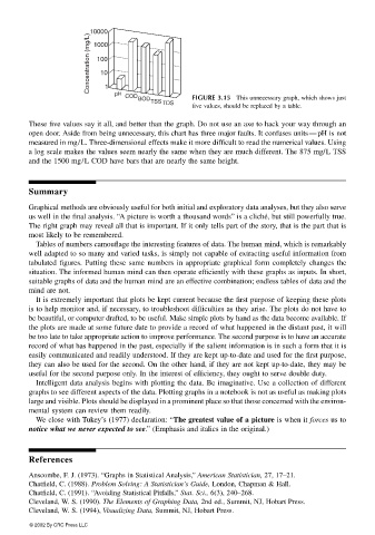
FIGURE 3.15 This unnecessary graph, which shows just
COD
BOD
TSS
five values, should be replaced by a table.
TDS
These five values say it all, and better than the graph. Do not use an axe to hack your way through an
open door. Aside from being unnecessary, this chart has three major faults. It confuses units—pH is not
measured in mg/L. Three-dimensional effects make it more difficult to read the numerical values. Using
a log scale makes the values seem nearly the same when they are much different. The 875 mg/L TSS
and the 1500 mg/L COD have bars that are nearly the same height.
Summary
Graphical methods are obviously useful for both initial and exploratory data analyses, but they also serve
us well in the final analysis. “A picture is worth a thousand words” is a cliché, but still powerfully true.
The right graph may reveal all that is important. If it only tells part of the story, that is the part that is
most likely to be remembered.
Tables of numbers camouflage the interesting features of data. The human mind, which is remarkably
well adapted to so many and varied tasks, is simply not capable of extracting useful information from
tabulated figures. Putting these same numbers in appropriate graphical form completely changes the
situation. The informed human mind can then operate efficiently with these graphs as inputs. In short,
suitable graphs of data and the human mind are an effective combination; endless tables of data and the
mind are not.
It is extremely important that plots be kept current because the first purpose of keeping these plots
is to help monitor and, if necessary, to troubleshoot difficulties as they arise. The plots do not have to
be beautiful, or computer drafted, to be useful. Make simple plots by hand as the data become available. If
the plots are made at some future date to provide a record of what happened in the distant past, it will
be too late to take appropriate action to improve performance. The second purpose is to have an accurate
record of what has happened in the past, especially if the salient information is in such a form that it is
easily communicated and readily understood. If they are kept up-to-date and used for the first purpose,
they can also be used for the second. On the other hand, if they are not kept up-to-date, they may be
useful for the second purpose only. In the interest of efficiency, they ought to serve double duty.
Intelligent data analysis begins with plotting the data. Be imaginative. Use a collection of different
graphs to see different aspects of the data. Plotting graphs in a notebook is not as useful as making plots
large and visible. Plots should be displayed in a prominent place so that those concerned with the environ-
mental system can review them readily.
We close with Tukey’s (1977) declaration: “The greatest value of a picture is when it forces us to
notice what we never expected to see.” (Emphasis and italics in the original.)
References
Anscombe, F. J. (1973). “Graphs in Statistical Analysis,” American Statistician, 27, 17–21.
Chatfield, C. (1988). Problem Solving: A Statistician’s Guide, London, Chapman & Hall.
Chatfield, C. (1991). “Avoiding Statistical Pitfalls,” Stat. Sci., 6(3), 240–268.
Cleveland, W. S. (1990). The Elements of Graphing Data, 2nd ed., Summit, NJ, Hobart Press.
Cleveland, W. S. (1994), Visualizing Data, Summit, NJ, Hobart Press.
© 2002 By CRC Press LLC