
Page 43 - Statistics for Environmental Engineers
P. 43
L1592_frame_C03 Page 34 Tuesday, December 18, 2001 1:41 PM
Average Number of Bald Eagle Hatchlings per Area 1.4
1.2
1.0
0.8
0.6
0.4
0.2
0
68
66
70 72
Year 74 76 78 80
1.
5
Average Number of Bald Eagle Hatchlings per Area 1. 0 Average Number of Bald Eagle Hatchlings per Area 1.2
1.0
0.8
0.6
0.
5
0.4
0
0.
1966 1968 1970 1972 1974 1976 1978 1980 0.2 0 66 68 70 72 74 76 78 80
Year
Year 1.4 DDT banned in
1.4
Mean Number of Young per Breeding Area 1.2 Bald Eagle Hatchlings per Nesting Site 1.2 Ontario in 1973
1.0
1.0
0.8
0.8
0.6
0.6
0.4
1965 1970 1975 1980 0.4 1965 1970 1975 1980
Year Year
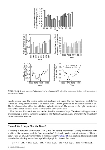
FIGURE 3.14 Several versions of plots that show how banning DDT helped the recovery of the bald eagle population in
northwestern Ontario.
middle row are clear. The version on the right is cleaner and clearer (the box frame is not needed). The
white lines through the bars serve as the vertical scale. The two graphs in the bottom row are better yet.
The bars become dots with a line added to emphasize the trend. The version on the right smoothes the
trend with a curve and adds a note to show when DDT was banned.
Most data sets, like this simple one, can be plotted in a variety of ways. The viewer will appreciate the
effort required to explore variations and present one that is clear, precise, and efficient in the presentation
of the essential information.
Should We Always Plot the Data?
According to Farquhar and Farquhar (1891), two 19th century economists, “Getting information from
a table is like extracting sunlight from a cucumber.” A virtually perfect rule of statistics is “Plot the
data.” There are times, however, when a plot is unnecessary. Figure 3.15 is an example. This is a simplified
reproduction (shading removed) of a published graph that showed five values.
pH = 5 COD = 2300 mg/L BOD = 1500 mg/L TSS = 875 mg/L TDS = 5700 mg/L
© 2002 By CRC Press LLC