
Page 39 - Statistics for Environmental Engineers
P. 39
L1592_frame_C03 Page 30 Tuesday, December 18, 2001 1:41 PM
12
10
8
Trickling Filter 6 4
2
0
0 5 10 15
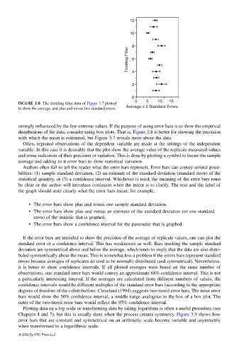
FIGURE 3.8 The trickling filter data of Figure 3.7 plotted
Average ± 2 Standard Errors
to show the average, and plus and minus two standard errors.
strongly influenced by the few extreme values. If the purpose of using error bars is to show the empirical
distributions of the data, consider using box plots. That is, Figure 3.8 is better for showing the precision
with which the mean is estimated, but Figure 3.7 reveals more about the data.
Often, repeated observations of the dependent variable are made at the settings of the independent
variable. In this case it is desirable that the plot show the average value of the replicate measured values
and some indication of their precision or variation. This is done by plotting a symbol to locate the sample
average and adding to it error bars to show statistical variation.
Authors often fail to tell the reader what the error bars represent. Error bars can convey several possi-
bilities: (1) sample standard deviation, (2) an estimate of the standard deviation (standard error) of the
statistical quantity, or (3) a confidence interval. Whichever is used, the meaning of the error bars must
be clear or the author will introduce confusion when the intent is to clarify. The text and the label of
the graph should state clearly what the error bars mean; for example,
• The error bars show plus and minus one sample standard deviation.
• The error bars show plus and minus an estimate of the standard deviation (or one standard
error) of the statistic that is graphed.
• The error bars show a confidence interval for the parameter that is graphed.
If the error bars are intended to show the precision of the average of replicate values, one can plot the
standard error or a confidence interval. This has weaknesses as well. Bars marking the sample standard
deviation are symmetrical above and below the average, which tends to imply that the data are also distri-
buted symmetrically about the mean. This is somewhat less a problem if the errors bars represent standard
errors because averages of replicates do tend to be normally distributed (and symmetrical). Nevertheless,
it is better to show confidence intervals. If all plotted averages were based on the same number of
observations, one-standard-error bars would convey an approximate 68% confidence interval. This is not
a particularly interesting interval. If the averages are calculated from different numbers of values, the
confidence intervals would be different multiples of the standard error bars (according to the appropriate
degrees of freedom of the t-distribution). Cleveland (1994) suggests two-tiered error bars. The inner error
bars would show the 50% confidence interval, a middle range analogous to the box of a box plot. The
outer of the two-tiered error bars would reflect the 95% confidence interval.
Plotting data on a log scale or transforming data by taking logarithms is often a useful procedure (see
Chapters 4 and 7), but this is usually done when the process creates symmetry. Figure 3.9 shows how
error bars that are constant and symmetrical on an arithmetic scale become variable and asymmetric
when transformed to a logarithmic scale.
© 2002 By CRC Press LLC