
Page 35 - Statistics for Environmental Engineers
P. 35
L1592_frame_C03 Page 26 Tuesday, December 18, 2001 1:41 PM
Concentration 1 80
70
60
50
679
42341
68 40
24442330 30
95877897
42321
7765 20
10
0
0 10 20 30 40
Time
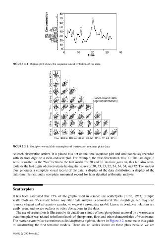
FIGURE 3.1 Digidot plot shows the sequence and distribution of the data.
BOD-in
BOD-out
SS-in
SS-out (log-transformation)
Jones Island Data
TP-in
TP-out
SP-in
SP-out
Flow BOD-in BOD-out SS-in SS-out TP-in TP-out SP-in
FIGURE 3.2 Multiple two-variable scatterplots of wastewater treatment plant data.
As each observation arrives, it is placed as a dot on the time-sequence plot and simultaneously recorded
with its final digit on a stem-and-leaf plot. For example, the first observation was 30. The last digit, a
zero, is written in the “bin” between the tick marks for 30 and 35. As time goes on, this bin also accu-
mulates the last digits of observations having the values of 30, 33, 33, 32, 34, 34, 34, and 32. The analyst
thus generates a complete visual record of the data: a display of the data distribution, a display of the
data time history, and a complete numerical record for later detailed arithmetic analysis.
Scatterplots
It has been estimated that 75% of the graphs used in science are scatterplots (Tufte, 1983). Simple
scatterplots are often made before any other data analysis is considered. The insights gained may lead
to more elegant and informative graphs, or suggest a promising model. Linear or nonlinear relations are
easily seen, and so are outliers or other aberrations in the data.
The use of scatterplots is illustrated with data from a study of how phosphorus removal by a wastewater
treatment plant was related to influent levels of phosphorus, flow, and other characteristics of wastewater.
The matrix scatterplots (sometimes called draftsman’s plots), shown in Figure 3.2, were made as a guide
to constructing the first tentative models. There are no scales shown on these plots because we are
© 2002 By CRC Press LLC