
Page 38 - Statistics for Environmental Engineers
P. 38
L1592_frame_C03 Page 29 Tuesday, December 18, 2001 1:41 PM
BODs in the 1980s are not as high as in the past. This reduction is what has improved the fishery, because
the highest BODs were occurring in the summer when stream flow was minimal and water temperature
was high. Several kinds of plots were needed to extract useful information from these data. This is often
the case with environmental data.
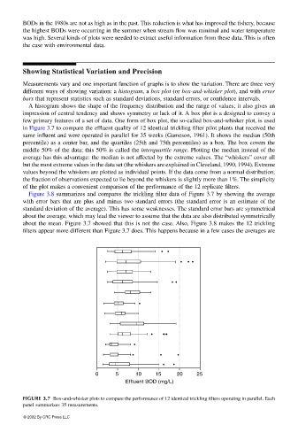
Showing Statistical Variation and Precision
Measurements vary and one important function of graphs is to show the variation. There are three very
different ways of showing variation: a histogram, a box plot (or box-and-whisker plot), and with error
bars that represent statistics such as standard deviations, standard errors, or confidence intervals.
A histogram shows the shape of the frequency distribution and the range of values; it also gives an
impression of central tendency and shows symmetry or lack of it. A box plot is a designed to convey a
few primary features of a set of data. One form of box plot, the so-called box-and-whisker plot, is used
in Figure 3.7 to compare the effluent quality of 12 identical trickling filter pilot plants that received the
same influent and were operated in parallel for 35 weeks (Gameson, 1961). It shows the median (50th
percentile) as a center bar, and the quartiles (25th and 75th percentiles) as a box. The box covers the
middle 50% of the data; this 50% is called the interquartile range. Plotting the median instead of the
average has this advantage: the median is not affected by the extreme values. The “whiskers” cover all
but the most extreme values in the data set (the whiskers are explained in Cleveland, 1990, 1994). Extreme
values beyond the whiskers are plotted as individual points. If the data come from a normal distribution,
the fraction of observations expected to lie beyond the whiskers is slightly more than 1%. The simplicity
of the plot makes a convenient comparison of the performance of the 12 replicate filters.
Figure 3.8 summarizes and compares the trickling filter data of Figure 3.7 by showing the average
with error bars that are plus and minus two standard errors (the standard error is an estimate of the
standard deviation of the average). This has some weaknesses. The standard error bars are symmetrical
about the average, which may lead the viewer to assume that the data are also distributed symmetrically
about the mean. Figure 3.7 showed that this is not the case. Also, Figure 3.8 makes the 12 trickling
filters appear more different than Figure 3.7 does. This happens because in a few cases the averages are
¥ ¥
¥ ¥¥
¥¥
¥
¥ ¥ ¥ ¥ ¥ ¥
¥ ¥
¥ ¥ ¥
¥ ¥
0 5 10 15 20 25
Effluent BOD (mg/L)
FIGURE 3.7 Box-and-whisker plots to compare the performance of 12 identical trickling filters operating in parallel. Each
panel summarizes 35 measurements.
© 2002 By CRC Press LLC