
Page 58 - Statistics for Environmental Engineers
P. 58
L1592_Frame_C05 Page 50 Tuesday, December 18, 2001 1:42 PM
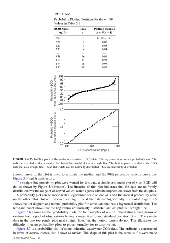
TABLE 5.2
Probability Plotting Positions for the n = 99
Values in Table 5.1
BOD Value Rank Plotting Position
(mg// //L) i p = 1// //(n + 1)
207 1 1/100 = 0.01
221 2 0.02
223 3 0.03
235 4 0.04
… … …
1158 96 0.96
1167 97 0.97
1174 98 0.98
1185 99 0.99
.999
.99
Probabiltity BOD less than Abscissa Value .95
.80
.50
.20
.05
.01
.001
1.0
Probabiltity BOD less than Abscissa Value 0.5
0.0
200 700 1200
BOD Concentration (mg/L)
FIGURE 5.4 Probability plots of the uniformly distributed BOD data. The top panel is a normal probability plot. The
ordinate is scaled so that normally distributed data would plot as a straight line. The bottom panel is scaled so the BOD
data plot as a straight line. These BOD data are not normally distributed. They are uniformly distributed.
smooth curve. If the plot is used to estimate the median and the 90th percentile value, a curve like
Figure 5.4(top) is satisfactory.
If a straight-line probability plot were wanted for this data, a simple arithmetic plot of p vs. BOD will
do, as shown by Figure 5.4(bottom). The linearity of this plot indicates that the data are uniformly
distributed over the range of observed values, which agrees with the impression drawn from the dot plots.
A probability plot can be made with a logarithmic scale on one axis and the normal probability scale
on the other. This plot will produce a straight line if the data are lognormally distributed. Figure 5.5
shows the dot diagram and normal probability plot for some data that has a lognormal distribution. The
left-hand panel shows that the logarithms are normally distributed and do plot as a straight line.
Figure 5.6 shows normal probability plots for four samples of n = 26 observations, each drawn at
random from a pool of observations having a mean η = 10 and standard deviation σ = 1. The sample
data in the two top panels plot neat straight lines, but the bottom panels do not. This illustrates the
difficulty in using probability plots to prove normality (or to disprove it).
Figure 5.7 is a probability plot of some industrial wastewater COD data. The ordinate is constructed
in terms of normal scores, also known as rankits. The shape of this plot is the same as if it were made
© 2002 By CRC Press LLC