
Page 60 - Statistics for Environmental Engineers
P. 60
L1592_Frame_C05 Page 52 Tuesday, December 18, 2001 1:42 PM
on normal probability paper. Normal scores or rankits can be generated in many computer software
packages (such as Microsoft Excel) and can be looked up in standard statistical tables (Sokal and Rohlf,
1969). This is handy because some graphics programs do not draw probability plots. Another advantage
of using rankits is that linear regression can be done on the rankit scores (see the example of censored
data analysis in Chapter 15).
The Use and Misuse Probability Plots
Engineering texts often suggest estimating the mean and sample standard deviations of a sample from
a probability plot, saying that the mean is located at p = 50% on a normal probability graph and the
standard deviation is the distance from p = 50% to p = 84.1% (or, because of symmetry, from p = 15.9%
to p = 50%). These graphical estimates are valid only when the data are normally distributed. Because
few environmental data sets are normally distributed, this graphical estimation of the mean and standard
deviation is not recommended. A probability plot is useful, however, to estimate the median ( p = 50%)
and to read directly any percentile of special interest.
One way that probability plots are misused is to make the graphical estimates of sample statistics
when the distribution is not normal. For example, if the data are lognormally distributed, p = 50% is the
median and not the arithmetic mean, and the distance from p = 50% to p = 84.1% is not the sample
standard deviation. If the data have a uniform distribution, or any other symmetrical distribution, p = 50%
is the median and the average, but the standard deviation cannot be read from the probability plot.
Randomness and Independence
Data can be normally distributed without being random or independent. Furthermore, randomness and
independence cannot be perceived or proven using a probability plot. This plot does not provide any
information regarding serial dependence or randomness, both of which may be more critical than
normality in the statistical analysis.
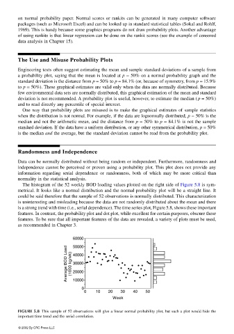
The histogram of the 52 weekly BOD loading values plotted on the right side of Figure 5.8 is sym-
metrical. It looks like a normal distribution and the normal probability plot will be a straight line. It
could be said therefore that the sample of 52 observations is normally distributed. This characterization
is uninteresting and misleading because the data are not randomly distributed about the mean and there
is a strong trend with time (i.e., serial dependence). The time series plot, Figure 5.8, shows these important
features. In contrast, the probability plot and dot plot, while excellent for certain purposes, obscure these
features. To be sure that all important features of the data are revealed, a variety of plots must be used,
as recommended in Chapter 3.
60000
50000
Average BOD Load (1000 kg/wk) 40000
30000
20000
10000
0
0 0 10 20 30 40 50
Week
FIGURE 5.8 This sample of 52 observations will give a linear normal probability plot, but such a plot would hide the
important time trend and the serial correlation.
© 2002 By CRC Press LLC