
Page 186 - The Handbook for Quality Management a Complete Guide to Operational Excellence
P. 186
172 P r o c e s s C o n t r o l Q u a n t i f y i n g P r o c e s s Va r i a t i o n 173
Using the data in Table 9.4:
sum of measurements 2475
X = = = = 99 0
.
number of measurements 25
−
−
.
LCL = X E R = 99 0 2 66 × 8 17 = 77 27
7
.
.
.
X 2
UCL = X E R = 99 0 2 66 ×. + . 8 17 =. 120 73
+
.
X 2
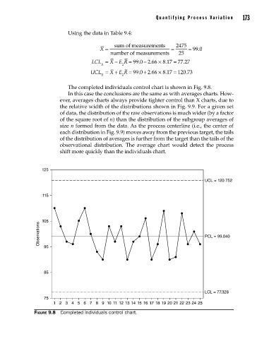
The completed individuals control chart is shown in Fig. 9.8.
In this case the conclusions are the same as with averages charts. How-
ever, averages charts always provide tighter control than X charts, due to
the relative width of the distributions shown in Fig. 9.9. For a given set
of data, the distribution of the raw observations is much wider (by a factor
of the square root of n) than the distribution of the subgroup averages of
size n formed from the data. As the process centerline (i.e., the center of
each distribution in Fig. 9.9) moves away from the previous target, the tails
of the distribution of averages is further from the target than the tails of the
observational distribution. The average chart would detect the process
shift more quickly than the individuals chart.
125
UCL = 120.752
115
105
Observations 95 PCL = 99.040
85
LCL = 77.328
75
1 2 3 4 5 6 7 8 9 10 11 12 13 14 15 16 17 18 19 20 21 22 23 24 25
Figure 9.8 Completed individuals control chart.
09_Pyzdek_Ch09_p151-208.indd 173 11/21/12 1:42 AM