
Page 189 - The Handbook for Quality Management a Complete Guide to Operational Excellence
P. 189
176 P r o c e s s C o n t r o l Q u a n t i f y i n g P r o c e s s Va r i a t i o n 177
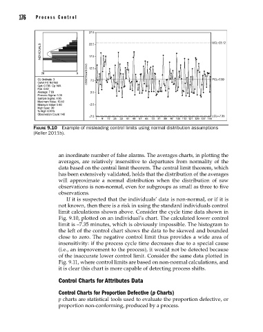
Figure 9.10 Example of misleading control limits using normal distribution assumptions
(Keller 2011b).
an inordinate number of false alarms. The averages charts, in plotting the
averages, are relatively insensitive to departures from normality of the
data based on the central limit theorem. The central limit theorem, which
has been extensively validated, holds that the distribution of the averages
will approximate a normal distribution when the distribution of raw
observations is non-normal, even for subgroups as small as three to five
observations.
If it is suspected that the individuals’ data is non-normal, or if it is
not known, then there is a risk in using the standard individuals control
limit calculations shown above. Consider the cycle time data shown in
Fig. 9.10, plotted on an individual’s chart. The calculated lower control
limit is –7.35 minutes, which is obviously impossible. The histogram to
the left of the control chart shows the data to be skewed and bounded
close to zero. The negative control limit thus provides a wide area of
insensitivity: if the process cycle time decreases due to a special cause
(i.e., an improvement to the process), it would not be detected because
of the inaccurate lower control limit. Consider the same data plotted in
Fig. 9.11, where control limits are based on non-normal calculations, and
it is clear this chart is more capable of detecting process shifts.
Control Charts for Attributes Data
Control Charts for Proportion Defective (p Charts)
p charts are statistical tools used to evaluate the proportion defective, or
proportion non-conforming, produced by a process.
09_Pyzdek_Ch09_p151-208.indd 176 11/21/12 1:42 AM