
Page 246 - Applied Statistics And Probability For Engineers
P. 246
c06.qxd 5/14/02 9:55 M Page 207 RK UL 6 RK UL 6:Desktop Folder:TEMP WORK:MONTGOMERY:REVISES UPLO D CH114 FIN L:Quark Files:
6-5 BOX PLOTS 207
6-34. Construct a frequency distribution and histogram with togram. Does it convey the same information as the stem-and-
16 bins for the motor fuel octane data in Exercise 6-14. Compare leaf display?
its shape with that of the histogram with eight bins from Exercise 6-40. Construct a histogram for the pinot noir wine rating data
6-30. Do both histograms display similar information? in Exercise 6-27. Comment on the shape of the histogram. Does
6-35. Construct a histogram for the female student height it convey the same information as the stem-and-leaf display?
data in Exercise 6-22. 6-41. The Pareto Chart. An important variation of a his-
6-36. Construct a histogram with 10 bins for the spot weld togram for categorical data is the Pareto chart. This chart is
shear strength data in Exercise 6-23. Comment on the shape of widely used in quality improvement efforts, and the categories
the histogram. Does it convey the same information as the usually represent different types of defects, failure modes, or
stem-and-leaf display? product/process problems. The categories are ordered so that
6-37. Construct a histogram for the water quality data in the category with the largest frequency is on the left, followed
Exercise 6-24. Comment on the shape of the histogram. Does by the category with the second largest frequency and so forth.
it convey the same information as the stem-and-leaf display? These charts are named after the Italian economist V. Pareto,
and they usually exhibit “Pareto’s law”; that is, most of the de-
6-38. Construct a histogram with 10 bins for the overall dis-
fects can be accounted for by only a few categories. Suppose
tance data in Exercise 6-25. Comment on the shape of the his-
that the following information on structural defects in auto-
togram. Does it convey the same information as the stem-and-
mobile doors is obtained: dents, 4; pits, 4; parts assembled out
leaf display?
of sequence, 6; parts undertrimmed, 21; missing holes/slots, 8;
6-39. Construct a histogram for the semiconductor speed
parts not lubricated, 5; parts out of contour, 30; and parts not
data in Exercise 6-26. Comment on the shape of the his-
deburred, 3. Construct and interpret a Pareto chart.
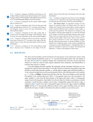
6-5 BOX PLOTS
The stem-and-leaf display and the histogram provide general visual impressions about a data
set, while numerical quantities such as x or s provide information about only one feature of
the data. The box plot is a graphical display that simultaneously describes several important
features of a data set, such as center, spread, departure from symmetry, and identification of
unusual observations or outliers.
A box plot displays the three quartiles, the minimum, and the maximum of the data on a rec-
tangular box, aligned either horizontally or vertically. The box encloses the interquartile range with
the left (or lower) edge at the first quartile, q , and the right (or upper) edge at the third quartile, q .
1
3
A line is drawn through the box at the second quartile (which is the 50th percentile or the median),
x. A line, or whisker, extends from each end of the box. The lower whisker is a line from the
q 2
first quartile to the smallest data point within 1.5 interquartile ranges from the first quartile. The
upper whisker is a line from the third quartile to the largest data point within 1.5 interquartile
ranges from the third quartile. Data farther from the box than the whiskers are plotted as individ-
ual points. A point beyond a whisker, but less than 3 interquartile ranges from the box edge, is
called an outlier. A point more than 3 interquartile ranges from the box edge is called an extreme
outlier. See Fig. 6-13. Occasionally, different symbols, such as open and filled circles, are used to
identify the two types of outliers. Sometimes box plots are called box-and-whisker plots.
Whisker extends to Whisker extends to
smallest data point within largest data point within
1.5 interquartile ranges from 1.5 interquartile ranges
first quartile from third quartile
First quartile Second quartile Third quartile
Outliers Outliers Extreme outlier
Figure 6-13 Descrip-
tion of a box plot. 1.5 IQR 1.5 IQR I IQR 1.5 IQR 1.5 IQR
I
I
I
I