
Page 249 - Applied Statistics And Probability For Engineers
P. 249
c06.qxd 5/14/02 9:55 M Page 210 RK UL 6 RK UL 6:Desktop Folder:TEMP WORK:MONTGOMERY:REVISES UPLO D CH114 FIN L:Quark Files:
210 CHAPTER 6 RANDOM SAMPLING AND DATA DESCRIPTION
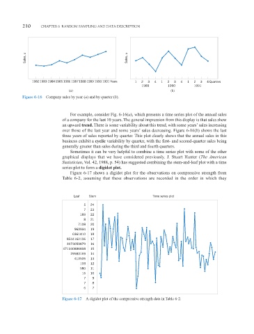
Sales, x Sales, x
19821983 1984 1985 1986 19871988 1989 1990 1991 Years 1 2 3 4 1 2 3 4 1 2 3 4 Quarters
1989 1990 1991
(a) (b)
Figure 6-16 Company sales by year (a) and by quarter (b).
For example, consider Fig. 6-16(a), which presents a time series plot of the annual sales
of a company for the last 10 years. The general impression from this display is that sales show
an upward trend. There is some variability about this trend, with some years’ sales increasing
over those of the last year and some years’ sales decreasing. Figure 6-16(b) shows the last
three years of sales reported by quarter. This plot clearly shows that the annual sales in this
business exhibit a cyclic variability by quarter, with the first- and second-quarter sales being
generally greater than sales during the third and fourth quarters.
Sometimes it can be very helpful to combine a time series plot with some of the other
graphical displays that we have considered previously. J. Stuart Hunter (The American
Statistician, Vol. 42, 1988, p. 54) has suggested combining the stem-and-leaf plot with a time
series plot to form a digidot plot.
Figure 6-17 shows a digidot plot for the observations on compressive strength from
Table 6-2, assuming that these observations are recorded in the order in which they
Leaf Stem Time series plot
5 24
7 23
189 22
8 21
7108 20
960934 19
0361410 18
8544162106 17
3073050879 16
471340886808 15
29583169 14
413535 13
103 12
580 11
15 10
7 9
7 8
6 7
Figure 6-17 A digidot plot of the compressive strength data in Table 6-2.