
Page 241 - Applied statistics and probability for engineers
P. 241
Section 6-5/Time Sequence Plots 219
(a) Find the median and the upper and lower quartiles of construct comparative box plots. Write an interpretation of the
temperature. information that you see in these plots.
(
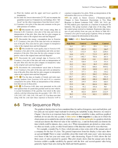
(b) Set aside the lowest observation 31° ) F and recompute the 6-81. An article in Nature Genetics [“Treatment-specii c
quantities in part (a). Comment on your indings. How “dif- Changes in Gene Expression Discriminate in Vivo Drug
ferent” are the other temperatures from this lowest value? Response in Human Leukemia Cells” (2003, Vol. 34(1), pp.
(c) Construct a box plot of the data and comment on the pos- 85–90)] studied gene expression as a function of treatments for
sible presence of outliers. leukemia. One group received a high dose of the drug, while
6-74. Reconsider the motor fuel octane rating data in the control group received no treatment. Expression data (meas-
Exercise 6-28. Construct a box plot of the data and write an ures of gene activity) from one gene are shown in Table 6E.1.
interpretation of the plot. How does the box plot compare in Construct a box plot for each group of patients. Write an interpre-
interpretive value to the original stem-and-leaf diagram? tation to compare the information in these plots.
6-75. Reconsider the energy consumption data in Exercise 5"#-& t 6E.1 Gene Expression
6-37. Construct a box plot of the data and write an interpreta-
tion of the plot. How does the box plot compare in interpretive High Dose Control Control Control
value to the original stem-and-leaf diagram? 16.1 297.1 25.1 131.1
6-76. Reconsider the water quality data in Exercise 6-40. 134.9 491.8 820.1 166.5
Construct a box plot of the concentrations and write an inter- 52.7 1332.9 82.5 2258.4
pretation of the plot. How does the box plot compare in inter- 14.4 1172 713.9 497.5
pretive value to the original stem-and-leaf diagram?
124.3 1482.7 785.6 263.4
6-77. Reconsider the weld strength data in Exercise 6-39. 99 335.4 114 252.3
Construct a box plot of the data and write an interpretation of
the plot. How does the box plot compare in interpretive value 24.3 528.9 31.9 351.4
to the original stem-and-leaf diagram? 16.3 24.1 86.3 678.9
15.2 545.2 646.6 3010.2
6-78. Reconsider the semiconductor speed data in Exercise
6-42. Construct a box plot of the data and write an interpreta- 47.7 92.9 169.9 67.1
tion of the plot. How does the box plot compare in interpretive 12.9 337.1 20.2 318.2
value to the original stem-and-leaf diagram? 72.7 102.3 280.2 2476.4
6-79. Use the data on heights of female and male engi- 126.7 255.1 194.2 181.4
neering students from Exercises 6-38 and 6-45 to construct 46.4 100.5 408.4 2081.5
comparative box plots. Write an interpretation of the informa- 60.3 159.9 155.5 424.3
tion that you see in these plots. 23.5 168 864.6 188.1
6-80 In Exercise 6-69, data were presented on the cold 43.6 95.2 355.4 563
start ignition time of a particular gasoline used in a test vehicle. 79.4 132.5 634 149.1
A second formulation of the gasoline was tested in the same 38 442.6 2029.9 2122.9
vehicle, with the following times (in seconds): 1.83, 1.99, 3.13, 58.2 15.8 362.1 1295.9
3.29, 2.65, 2.87, 3.40, 2.46, 1.89, and 3.35. Use these new data
along with the cold start times reported in Exercise 6-69 to 26.5 175.6
6-5 Time Sequence Plots
The graphical displays that we have considered thus far such as histograms, stem-and-leaf plots, and
box plots are very useful visual methods for showing the variability in data. However, we noted in
Chapter 1 that time is an important factor that contributes to variability in data, and those graphical
methods do not take this into account. A time series or time sequence is a data set in which the
observations are recorded in the order in which they occur. A time series plot is a graph in which the
x
vertical axis denotes the observed value of the variable (say, ) and the horizontal axis denotes the
time (which could be minutes, days, years, etc.). When measurements are plotted as a time series,
we often see trends, cycles, or other broad features of the data that could not be seen otherwise.
For example, consider Fig. 6-16(a), which presents a time series plot of the annual sales of
a company for the last 10 years. The general impression from this display is that sales show
an upward trend. There is some variability about this trend with some years’ sales increasing
over those of the last year and some years’ sales decreasing. Figure 6-16(b) shows the last
three years of sales reported by quarter. This plot clearly shows that the annual sales in this
business exhibit a cyclic variability by quarter with the irst- and second-quarter sales being
generally higher than sales during the third and fourth quarters.