
Page 237 - Applied statistics and probability for engineers
P. 237
Section 6-3/Frequency Distributions and Histograms 215
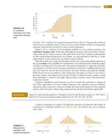
80
70
Cumulative frequency 50
60
40
30
FIGURE 6-10 20
A cumulative 10
distribution plot of the 0
compressive strength 100 150 200 250
data. Strength
nine bins. This is similar to the original histogram shown in Fig. 6-7. Because the number of
observations is moderately large (n = 80 ), the choice of the number of bins is not especially
important, and both Figs. 6-8 and 6-9 convey similar information.
Figure 6-10 is a variation of the histogram available in some software packages, the
cumulative frequency plot. In this plot, the height of each bar is the total number of obser-
vations that are less than or equal to the upper limit of the bin. Cumulative distributions
are also useful in data interpretation; for example, we can read directly from Fig. 6-10 that
approximately 70 observations are less than or equal to 200 psi.
When the sample size is large, the histogram can provide a reasonably reliable indicator of
the general shape of the distribution or population of measurements from which the sample
was drawn. See Figure 6-11 for three cases. The median is denoted as ɶ x. Generally, if the data
are symmetric, as in Fig. 6-11(b), the mean and median coincide. If, in addition, the data have
only one mode (we say the data are unimodal), the mean, median, and mode all coincide.
If the data are skewed (asymmetric, with a long tail to one side), as in Fig. 6-11(a) and (c),
the mean, median, and mode do not coincide. Usually, we i nd that mode < median < mean
if the distribution is skewed to the right, whereas mode > median > mean if the distribution
is skewed to the left.
Frequency distributions and histograms can also be used with qualitative or categorical
data. Some applications will have a natural ordering of the categories (such as freshman,
sophomore, junior, and senior), whereas in others, the order of the categories will be arbitrary
(such as male and female). When using categorical data, the bins should have equal width.
Example 6-6 Figure 6-12 presents the production of transport aircraft by the Boeing Company in 1985. Notice
that the 737 was the most popular model, followed by the 757, 747, 767, and 707.
A chart of occurrences by category (in which the categories are ordered by the number of
occurrences) is sometimes referred to as a Pareto chart. An exercise asks you to construct
such a chart.
FIGURE 6-11
x
Histograms for x | x x | x
| x
symmetric and Negative or left skew Symmetric Positive or right skew
skewed distributions. (a) (b) (c)