
Page 239 - Applied statistics and probability for engineers
P. 239
Section 6-4/Box Plots 217
pits, 4; parts assembled out of sequence, 6; parts under- 6-62. Construct a frequency distribution and histogram for the
trimmed, 21; missing holes/slots, 8; parts not lubricated, 5; acid rain measurements in Exercise 6-21.
parts out of contour, 30; and parts not deburred, 3. Construct 6-63. Construct a frequency distribution and histogram for the
and interpret a Pareto chart. combined cloud-seeding rain measurements in Exercise 6-22.
6-61. Construct a frequency distribution and histogram for the 6-64. Construct a frequency distribution and histogram for the
bridge condition data in Exercise 6-20. swim time measurements in Exercise 6-24.
6-4 Box Plots
The stem-and-leaf display and the histogram provide general visual impressions about a data
set, but numerical quantities such as x or s provide information about only one feature of
the data. The box plot is a graphical display that simultaneously describes several important
features of a data set, such as center, spread, departure from symmetry, and identiication of
unusual observations or outliers.
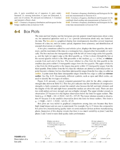
A box plot, sometimes called box-and-whisker plots, displays the three quartiles, the mini-
mum, and the maximum of the data on a rectangular box, aligned either horizontally or verti-
cally. The box encloses the interquartile range with the left (or lower) edge at the irst quartile,
q 1 , and the right (or upper) edge at the third quartile, q 3 . A line is drawn through the box at
the second quartile (which is the 50th percentile or the median), q 2 = x. A line, or whisker,
extends from each end of the box. The lower whisker is a line from the irst quartile to the
smallest data point within 1.5 interquartile ranges from the irst quartile. The upper whisker is
a line from the third quartile to the largest data point within 1.5 interquartile ranges from the
third quartile. Data farther from the box than the whiskers are plotted as individual points. A
point beyond a whisker, but less than three interquartile ranges from the box edge, is called an
outlier. A point more than three interquartile ranges from the box edge is called an extreme
outlier. See Fig. 6-13. Occasionally, different symbols, such as open and illed circles, are
used to identify the two types of outliers.
Figure 6-14 presents a typical computer-generated box plot for the alloy compressive
strength data shown in Table 6-2. This box plot indicates that the distribution of compressive
strengths is fairly symmetric around the central value because the left and right whiskers and
the lengths of the left and right boxes around the median are about the same. There are also
two mild outliers at lower strength and one at higher strength. The upper whisker extends to
observation 237 because it is the highest observation below the limit for upper outliers. This
+ (
−
+
.
.
.
.
limit is q 3 1 5IQR = 181 1 5 181 143 5) = 237 25. The lower whisker extends to observa-
tion 97 because it is the smallest observation above the limit for lower outliers. This limit is
− (
.
−
.
.
.
−
.
q 1 1 5IQR = 143 5 1 5 181 143 5) = 87 25.
Box plots are very useful in graphical comparisons among data sets because they have
high visual impact and are easy to understand. For example, Fig. 6-15 shows the comparative
box plots for a manufacturing quality index on semiconductor devices at three manufacturing
plants. Inspection of this display reveals that there is too much variability at plant 2 and that
plants 2 and 3 need to raise their quality index performance.
Whisker extends to Whisker extends to
smallest data point within largest data point within
1.5 interquartile ranges from 1.5 interquartile ranges
first quartile from third quartile
First quartile Second quartile Third quartile
FIGURE 6-13
Description of a Outliers Outliers Extreme outlier
box plot. 1.5 IQR 1.5 IQR IQR 1.5 IQR 1.5 IQR