Page 136 - Computational Statistics Handbook with MATLAB
P. 136

Chapter 5: Exploratory Data Analysis                            123


                                        3


                                        2


                                      Sorted Y Values  1

                                        0


                                       −1


                                       −2

                                       −3
                                        −3      −2     −1       0      1      2       3
                                                        Sample Quantiles − X
                               U
                              FI F IG URE G 5.  RE 5. 8  8
                              F F II  GU  RE RE 5. 5.  8
                               GU
                                     8
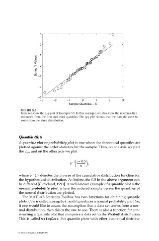
                              Here we show the q-q plot of Example 5.5. In this example, we also show the reference line
                              estimated from the first and third quartiles. The q-q plot shows that the data do seem to
                              come from the same distribution.

                             Qu
                             QuQu
                               annt
                                  ilePlotPlot
                                  ile
                             Qu  aanntt tilePlotilePlots  ss s
                             a
                             A quantile plot or probability plot is one where the theoretical quantiles are
                             plotted against the order statistics for the sample. Thus, on one axis we plot
                             the x i()  and on the other axis we plot
                                                          –   0.5 
                                                           1 i –
                                                         F   ---------------   ,
                                                               n
                             where F ()   denotes the inverse of the cumulative distribution function for
                                     1
                                    –
                                      .
                             the hypothesized distribution. As before, the 0.5 in the above argument can
                             be different [Cleveland, 1993]. A well-known example of a quantile plot is the
                             normal probability plot, where the ordered sample versus the quantiles of
                             the normal distribution are plotted.
                              The MATLAB Statistics Toolbox has two functions for obtaining quantile
                             plots. One is called normplot, and it produces a normal probability plot. So,
                             if one would like to assess the assumption that a data set comes from a nor-
                             mal distribution, then this is the one to use. There is also a function for con-
                             structing a quantile plot that compares a data set to the Weibull distribution.
                             This is called weibplot. For quantile plots with other theoretical distribu-


                            © 2002 by Chapman & Hall/CRC
   131   132   133   134   135   136   137   138   139   140   141