Page 156 - Computational Statistics Handbook with MATLAB
P. 156

Chapter 5: Exploratory Data Analysis                            143


                                       4

                                       2
                                                                0.1
                                       0                       0.05

                                      −2                         0
                                                                  2
                                      −4                             0           0  2
                                        −4  −2    0    2   4           −2    −2


                               G
                               U
                               GU
                                  5.2
                                  5.2
                              F FI F F II IG URE GU 5.2  RE RE RE 5.2 2  2 2 2
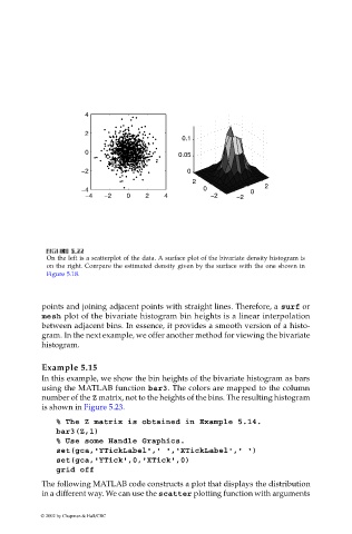
                              On the left is a scatterplot of the data. A surface plot of the bivariate density histogram is
                              on the right. Compare the estimated density given by the surface with the one shown in
                              Figure 5.18.
                             points and joining adjacent points with straight lines. Therefore, a surf or
                             mesh plot of the bivariate histogram bin heights is a linear interpolation
                             between adjacent bins. In essence, it provides a smooth version of a histo-
                             gram. In the next example, we offer another method for viewing the bivariate
                             histogram.


                             Example 5.15
                             In this example, we show the bin heights of the bivariate histogram as bars
                             using the MATLAB function bar3. The colors are mapped to the column
                             number of the Z matrix, not to the heights of the bins. The resulting histogram
                             is shown in Figure 5.23.
                                % The Z matrix is obtained in Example 5.14.
                                bar3(Z,1)
                                % Use some Handle Graphics.
                                set(gca,'YTickLabel',' ','XTickLabel',' ')
                                set(gca,'YTick',0,'XTick',0)
                                grid off
                             The following MATLAB code constructs a plot that displays the distribution
                             in a different way. We can use the scatter plotting function with arguments


                            © 2002 by Chapman & Hall/CRC
   151   152   153   154   155   156   157   158   159   160   161