Page 158 - Computational Statistics Handbook with MATLAB
P. 158
Chapter 5: Exploratory Data Analysis                            145


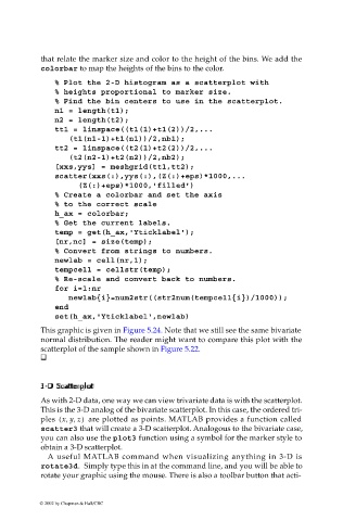
                             that relate the marker size and color to the height of the bins. We add the
                             colorbar to map the heights of the bins to the color.

                                % Plot the 2-D histogram as a scatterplot with
                                % heights proportional to marker size.
                                % Find the bin centers to use in the scatterplot.
                                n1 = length(t1);
                                n2 = length(t2);
                                tt1 = linspace((t1(1)+t1(2))/2,...
                                    (t1(n1-1)+t1(n1))/2,nb1);
                                tt2 = linspace((t2(1)+t2(2))/2,...
                                    (t2(n2-1)+t2(n2))/2,nb2);
                                [xxs,yys] = meshgrid(tt1,tt2);
                                scatter(xxs(:),yys(:),(Z(:)+eps)*1000,...
                                      (Z(:)+eps)*1000,'filled')
                                % Create a colorbar and set the axis
                                % to the correct scale
                                h_ax = colorbar;
                                % Get the current labels.
                                temp = get(h_ax,'Yticklabel');
                                [nr,nc] = size(temp);
                                % Convert from strings to numbers.
                                newlab = cell(nr,1);
                                tempcell = cellstr(temp);
                                % Re-scale and convert back to numbers.
                                for i=1:nr
                                   newlab{i}=num2str((str2num(tempcell{i})/1000));
                                end
                                set(h_ax,'Yticklabel',newlab)
                             This graphic is given in Figure 5.24. Note that we still see the same bivariate
                             normal distribution. The reader might want to compare this plot with the
                             scatterplot of the sample shown in Figure 5.22.


                              c
                              a
                                   at
                                      rploplo
                                       t
                             3-
                             3-DSDS  aatt tt tt teer eerr ploplo  t tt
                             33-- DSDS
                               c
                               c
                               c
                             As with 2-D data, one way we can view trivariate data is with the scatterplot.
                             This is the 3-D analog of the bivariate scatterplot. In this case, the ordered tri-
                             ples  xy z,,(  )   are plotted as points. MATLAB provides a function called
                             scatter3 that will create a 3-D scatterplot. Analogous to the bivariate case,
                             you can also use the plot3 function using a symbol for the marker style to
                             obtain a 3-D scatterplot.
                              A useful MATLAB command when visualizing anything in 3-D is
                             rotate3d. Simply type this in at the command line, and you will be able to
                             rotate your graphic using the mouse. There is also a toolbar button that acti-
                            © 2002 by Chapman & Hall/CRC

