
Page 435 - Excel 2007 Bible
P. 435
26_044039 ch20.qxp 11/21/06 11:11 AM Page 392
Part III
Creating Charts and Graphics
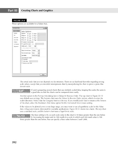
FIGURE 20.8
These options are available for a Value Axis.
The actual scale that you use depends on the situation. There are no hard-and-fast rules regarding setting
scale values, except that you shouldn’t misrepresent data by manipulating the chart to prove a point that
doesn’t exist.
TIP If you’re preparing several charts that use similarly scaled data, keeping the scales the same is
TIP
a good idea so that the charts can be compared more easily.
Another option in the Format Axis dialog box is Values In Reverse Order. The top chart in Figure 20.10
uses default axis settings. The bottom chart uses the Values In Reverse Order option, which reverses the
scale’s direction. Notice that the Category Axis is at the top. If you would prefer that it remain at the bottom
of the chart, select the Maximum Axis Value option for the Horizontal Axis Crosses setting.
If the values to be plotted cover a very large range, you may want to use a logarithmic scale for the Value
Axis. A log scale is most often used for scientific applications. Figure 20.11 shows two charts. The top chart
uses a standard scale, and the bottom chart uses a logarithmic scale.
NOTE The Base setting is 10, so each scale value in the chart is 10 times greater than the one below
NOTE
it. Increasing the major unit to 100 results in a scale in which each tick mark value is 100
times greater than the one below. You can specify a Base value between 2 and 1,000.
392