
Page 439 - Excel 2007 Bible
P. 439
26_044039 ch20.qxp 11/21/06 11:11 AM Page 396
Part III
Creating Charts and Graphics
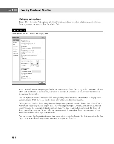
Category axis options
Figure 20.14 shows the Axis Options tab of the Format Axis dialog box when a Category Axis is selected.
Some options are the same as those for a Value Axis.
FIGURE 20.14
These options are available for a Category Axis.
Excel chooses how to display category labels, but you can override its choice. Figure 20.15 shows a column
chart with month labels. Excel displays the labels at an angle. If you make the chart wider, the labels will
then appear horizontally.
You can adjust the Interval Between Labels settings to skip some labels and cause the text to display hori-
zontally. Figure 20.16 shows the chart with an Interval Between Labels setting of 3.
When you create a chart, Excel recognizes whether your category axis contains date or time values. If so, it
uses a time-based category axis. Figure 20.17 shows a simple example. Column A contains dates, and col-
umn B contains the values plotted in the column chart. The data consists of values for only 10 dates, yet
Excel created the chart with 30 intervals on the category axis. It recognized that the category axis values
were dates and created an equal-interval scale.
You can override Excel’s decision to use a time-based category axis by choosing the Text Axis option for Axis
Type. Using a time-based category axis presents a truer picture of the data.
396