
Page 437 - Excel 2007 Bible
P. 437
26_044039 ch20.qxp 11/21/06 11:11 AM Page 394
Part III
Creating Charts and Graphics
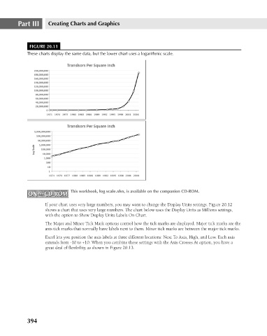
FIGURE 20.11
These charts display the same data, but the lower chart uses a logarithmic scale.
ON the CD-ROM This workbook, log scale.xlsx, is available on the companion CD-ROM.
ON the CD-ROM
If your chart uses very large numbers, you may want to change the Display Units settings. Figure 20.12
shows a chart that uses very large numbers. The chart below uses the Display Units as Millions settings,
with the option to Show Display Units Labels On Chart.
The Major and Minor Tick Mark options control how the tick marks are displayed. Major tick marks are the
axis tick marks that normally have labels next to them. Minor tick marks are between the major tick marks.
Excel lets you position the axis labels at three different locations: Next To Axis, High, and Low. Each axis
extends from -10 to +10. When you combine these settings with the Axis Crosses At option, you have a
great deal of flexibility, as shown in Figure 20.13.
394